The Challenge
Iconography design was a course I took in my 3rd year of graphic design at Vancouver Island University. Within the course, the task was to create a suite of icons, as well as design a landing page that showcases the icons we created, what they represent, and demonstrate our ability to properly format a data table.
The first part of the project was to sketch and design concepts for icons that represent Data Enrichment, Data Quality, Location Intelligence, and Data Integration. We were asked to create five different sketches for each icon, and only after were we asked to select one icon concept form each category to keep as our final icon designs.
ICON CONCEPTS
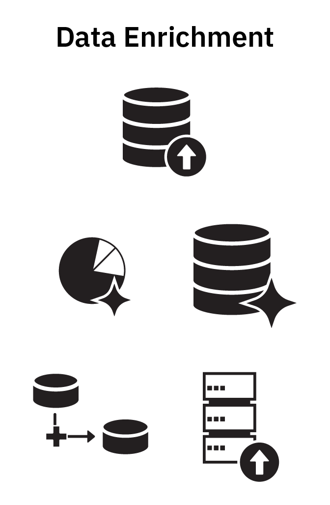
Data Enrichment Concepts

Data Integration Concepts

Data Quality Concepts

Location Intelligence Concepts
Revised & FInal Icon Designs
The next part of the process was to refine the designs for each icon to ensure accessibility remains visible, the number of points are reduced to ensure a cleaner design, and unnecessary details are removed from the icons to improve accessibility and understanding.
Once the designs were refined and perfected, the process of making colour variants for each icon began. To keep the icons on brand with the provided materials, we were given a finite colour palette that included the brand colours from the fictional company we were working with.
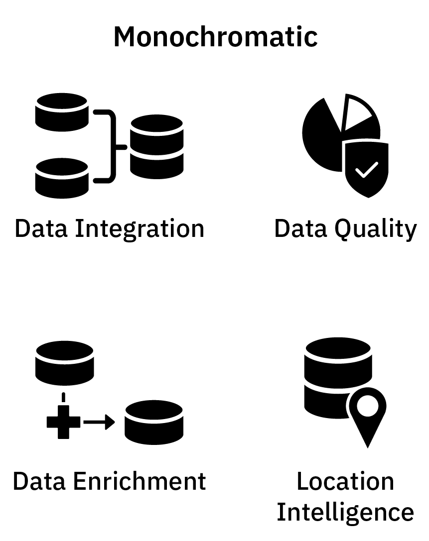
Monchromatic Icon Set
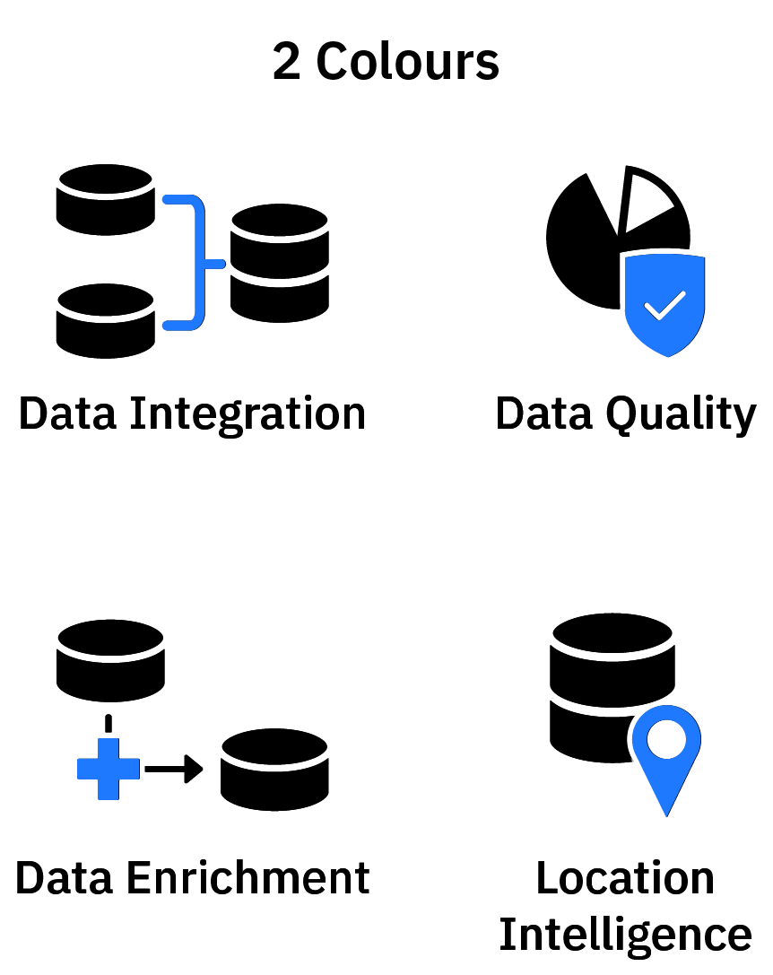
2 Colour Icon Set
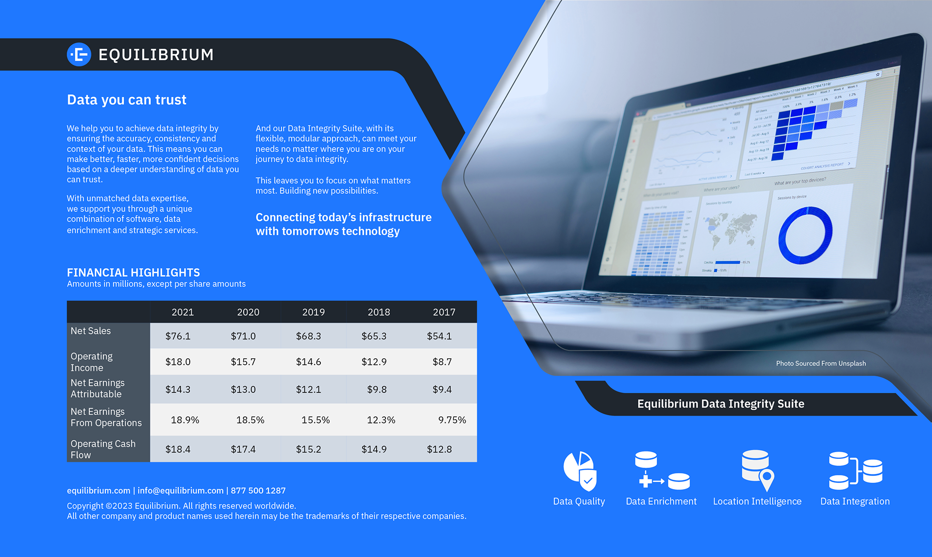
Icon Landing Page
Having completed the icons, the final part of the project was to create a landing page with the company's branding that explains what the icons mean, service descriptions (which were provided to us my the professor), and a data table that would need proper formatting.
We were given free range over the design and layout of the landing page, graphics, and any photos we wanted to include in the design.