This collection is for logos I created, many of which are for fictional brand which I created myself. The logos are meant to experiment with different design techniques and styles.
For each brand, I include the name and a brief description about the logo and any design elements that stand out.
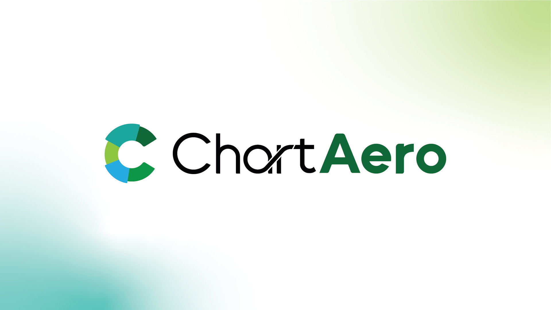
Brand: ChartAero [Fictional]
Type of Business: Information Presentation
Logo Description: Present Creativity.
The icon represents a pie chart to represent the business' products of presenting information in the most effectice way, as well as subtly forming a 'C' to represent the brands name.
The logotype was created on Illustrator mainly using the shape builder, ellipse, and pen tools. The logotype is custom-made and is meant to replicate the fluid movement of information.
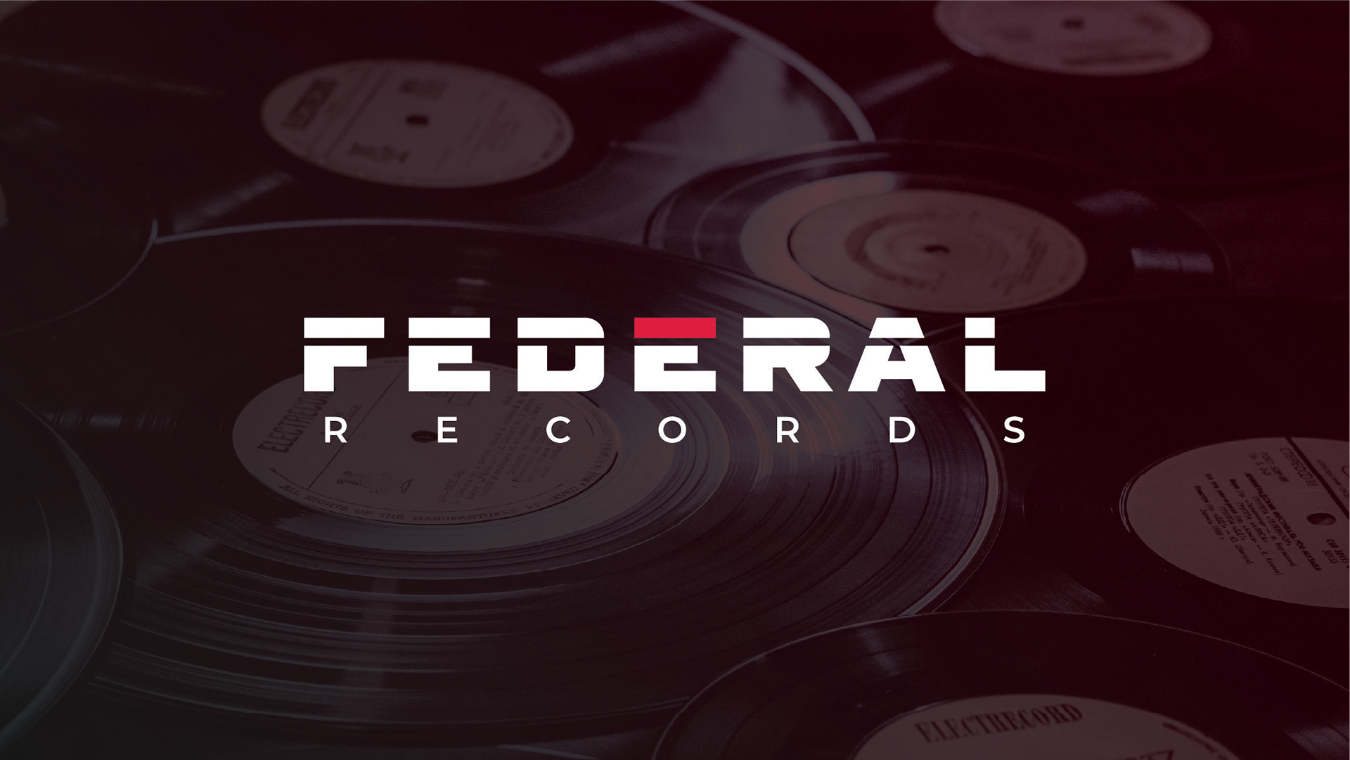
Brand: Federal Records [Fictional]
Type of Business: Record Label
Logo Description: Nostalgia, Revived.
The logo for Federal Records was created with retro-futurism in mind. The logotype is reminiscent of the bold fonts used during the 70's and 80's, while incorporating more modern typefaces like Montserrat for the 'Records' portion.
The line running through the logotype is meant to symbolize a record at eye-level, cutting through the wordmark, while the red portion of the 'E' is meant to act as a weight over top of the record.
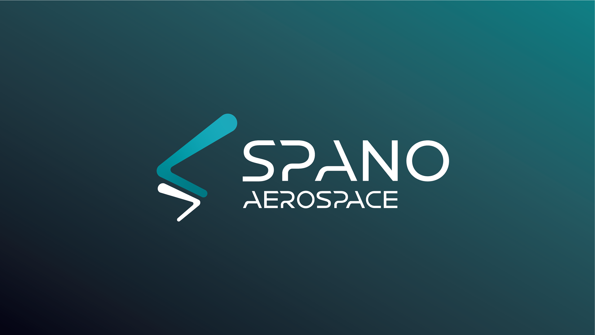
Brand: Spano Aerospace [Fictional]
Type of Business: Aerospace & Defence
Logo Description: Conquer Every Frontier.
For the main logo of Spano Aerospace, I wanted to take inspiration from the contrails left behind rockets as they fly away. Making the design of the logo was created by starting with a path and using the width adjustment tool to create the varied thickness of the logo, colloquially known as the "Spano Contrail". I adjusted the logo to create a hidden 'S' to tie in with the brands name.
For the word mark, I created it by using Montserrat and replacing various letters (S, P, A, O, R, C) with custom letters created to give the wordmark a modern and futuristic feel. I chose to use teal, both a light and dark variant, and white for the logo to represent the skies and deep space that lies beyond.
Brand: Uranco Uranium Industries [Fictional]
Type of Business: Mining & Refineries
Logo Description: Powering Tomorrows Future.
The main wordmark for Uranco was created by using Magistral and adjusted the typeface by rouding the edges to create a smoother design. By combining the Magistral and Montserrat typefaces, I am able to design an upscale identity for the brand that allows them to convey the clean, versatile, and reliable characteristics of uranium and nuclear power.
The icon of Uranco is created to represent a diamond, which is a primary element used in uranium mining, as well as to create a topographical design of a uranium pit mine. The brands use of greens are intended to represent the use of clean, green energy that stems from nuclear power, and the gold is is used to add emphasis to the up-scale nature of the brand.

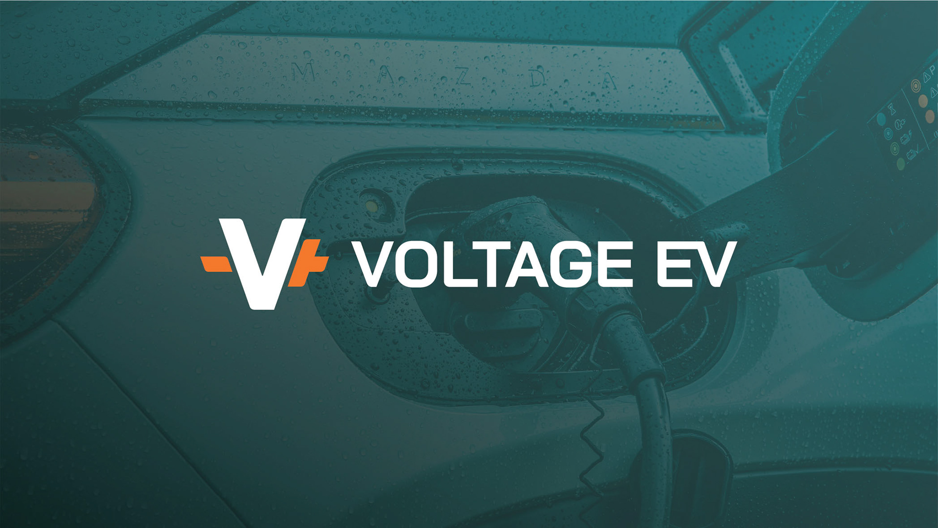
Brand: Voltage EV [Fictional]
Type of Business: Electric Vehicle Chargers
Logo Description: Powering The Road Ahead.
This logo was created as part of a user interface and experience project I created at North Island College, and wanted to expand the elements of the logo to create a more unique logo. The main icon for the wordmark is a simple 'V' but with a positive and negative symbol on either side to represent the terminals on a battery. This is a stylistic choice that further connects the brands connection to EVs and the Automotive Industry.
The wordmark is simple and straight to the point, the major design element for the wordmark is the connected 'EV' at the end to simbolize the connected journey EV users take on a daily basis. The letters have been adjusted slightly to make them less sharp.