
The Challenge
The challenge was to create a fictional magazine that includes a complete two-page article spread, 1-2 full-page advertisements, a ‘Letter From The Editor’ page, and a detailed cover page that implies to the viewer what genre the magazine is.
The Approach
I first looked at competing automotive magazines to see what type of content they feature, any design elements that stand out to me as being decidedly automotive related, and the look/feel they evoke. Many automotive magazines tend to include as many images of cars as possible on the front cover to attract the reader, but I feel that this makes the cover busy, and at times, can make focusing on one article block at a time difficult. This is why I opted for a minimalist design for my cover page.
For the advertisement pages, I browsed the multitude of automotive advertisements that one sees in the various automotive magazines, and I took inspiration from the ads that aim to create excitement for future vehicle models and exciting updates to their existing line-up.
Many vehicle specs and details are not as clearly indicated on other magazine spreads, which is one detail that I want to correct with my magazine article spread. I aimed to keep the important vehicle specs and information that readers tend to view as the most important as easily accessible as I could.
Article Spread Design
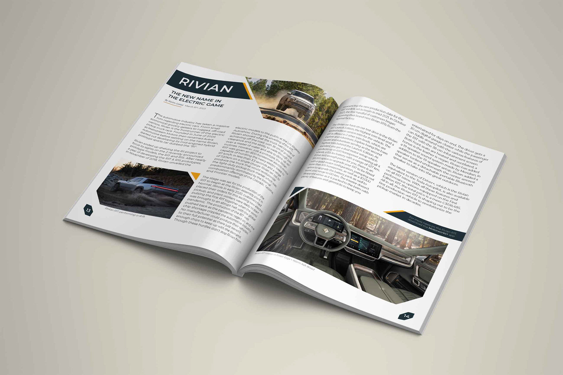
For the main article spread, I arranged the text in a 2-column layout to experiment with the column layout system InDesign offers. To complete the article, several images of the featured vehicle are shown to give the reader more information about what the car looks like from both the interior and exterior angles.

Main Article Spread Design
Cover Page Design
To appeal to the target audience more easily, I opted to make the cover image the focal point of the front cover. This means that having less focus on the magazine branding allows for the focus to be on the image. The cover still retains the necessary article pages and titles, but has been moved to the side to act as secondary items so as not to take away attention from the cover image.
The advert and back cover on the right takes design influence from adverts from the 1950s and 60s. Because this page is advertising a fictional car from the Fallout games, I chose to use graphic elements that represent atoms, as the vehicle is a fusion-powered car. I wanted to keep the advert simple and vibrant in comparison to the Hummer advert I created for the first spread.
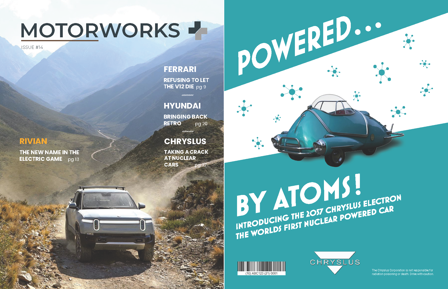
Motorworks Magazine Front & Back Covers
Inner Spread Design
The advertisement pages were created from the ground up and portray real-life and fictional vehicles. For the Hummer advert, I took elements from other publicly available advertisements that car manufacturers use to drum up attention for their new models, these being cars covered in black covers to preview the shape and body lines, darkroom teasers with the lights on, and blurred/concealed photos. Choosing the darkroom teaser aspect allowed me to find some concept photos that the company released, and I was able to tease the vehicle without revealing its design, as it was not yet unveiled to the public at the time.
I wanted the From The Editor page to be as light as possible as to keep the readers focus on the main content of the magazine, which is the article spread. The From The Editor page also sets up the following spreads up in terms of branding and identity.
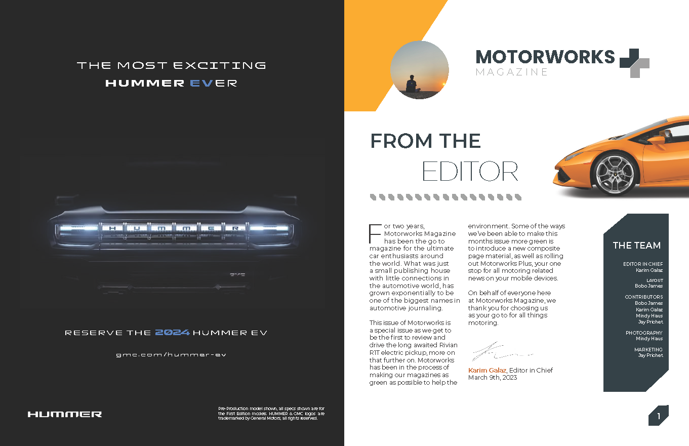
Advertisment page & From The Editor page
To visualize how the spreads might look like if they became a reality, I created a mockup of a magazine and inserted the "From The Editor" page. Having a mockup such as this helps with conceptualizing my design and get a visual understanding of where or what needs to be fixed.
To see the complete PDF, click the button below.
Magazine Spread mockup