The Challenge
This project is intended to work on my branding and package design skills from my 3rd year of graphic design at Vancouver Island University. In this project, I created a Gin brand from the ground up starting with the logo design and finishing with a variety of mockups to showcase the product.
The Approach
I wanted to experiment with creating a brand that reflects the primary audience of gin drinkers, mainly being members of the upper-class, executives, and people with a taste for luxury. Choosing the name Osprey made sense for a variety of reasons; first, the name itself is a high-class sounding name and can easily resonate with gin drinkers with a premium taste, second, the Osprey bird is known for its focus, skills, and mastery of nature, similar to the brand being a mastery of gin production.
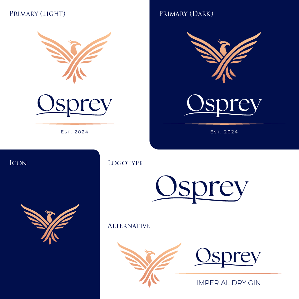
Logo Suite
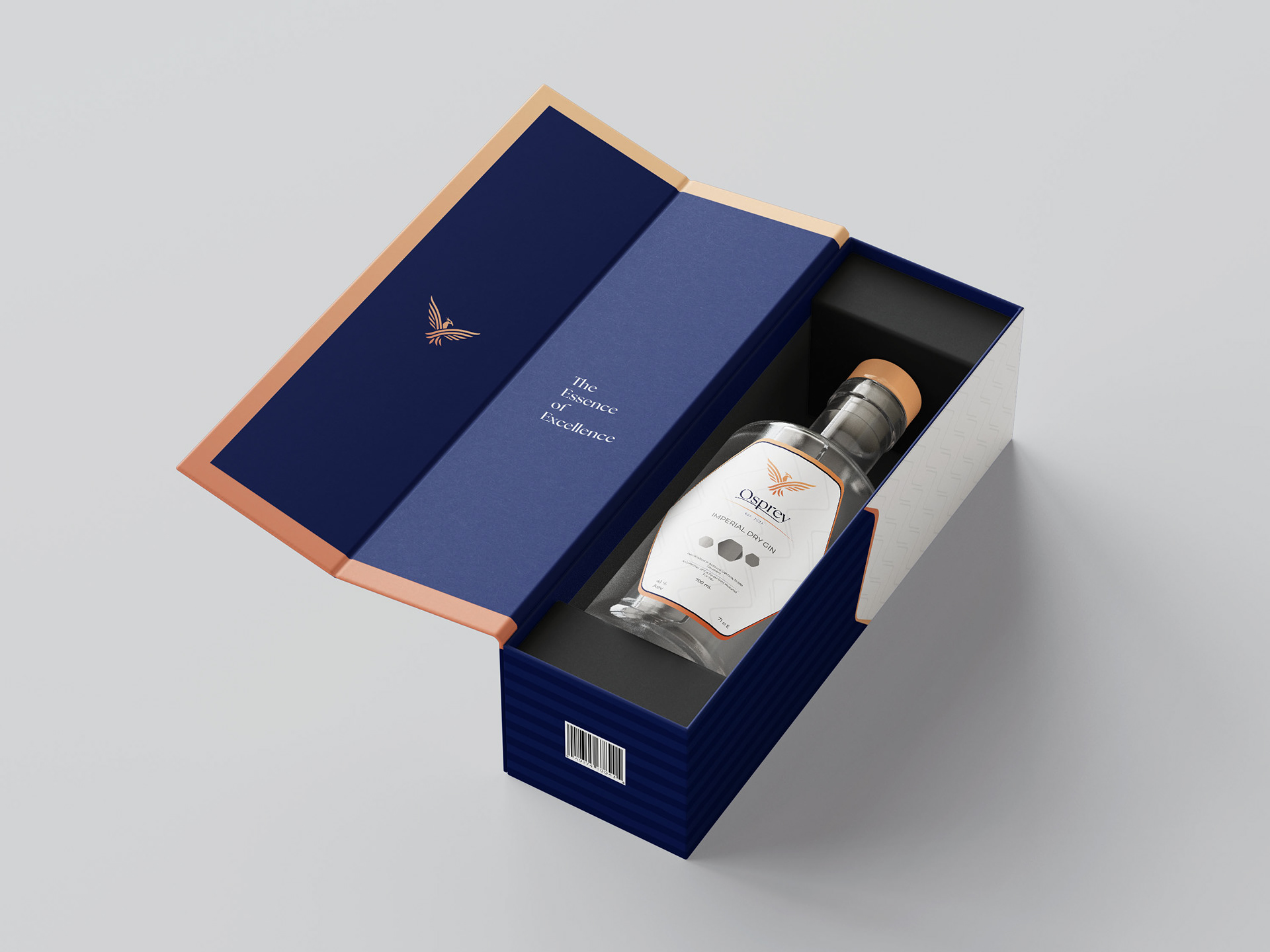
The logo for Osprey Gin is inspired by the Osprey bird, and integrates the elegant wingspan of the bird to add a level of luxury and class to the brand. The typeface was modified to reflect luxury appeal of the brand by lengthening the tail of the 'Y' to underline the logotype.
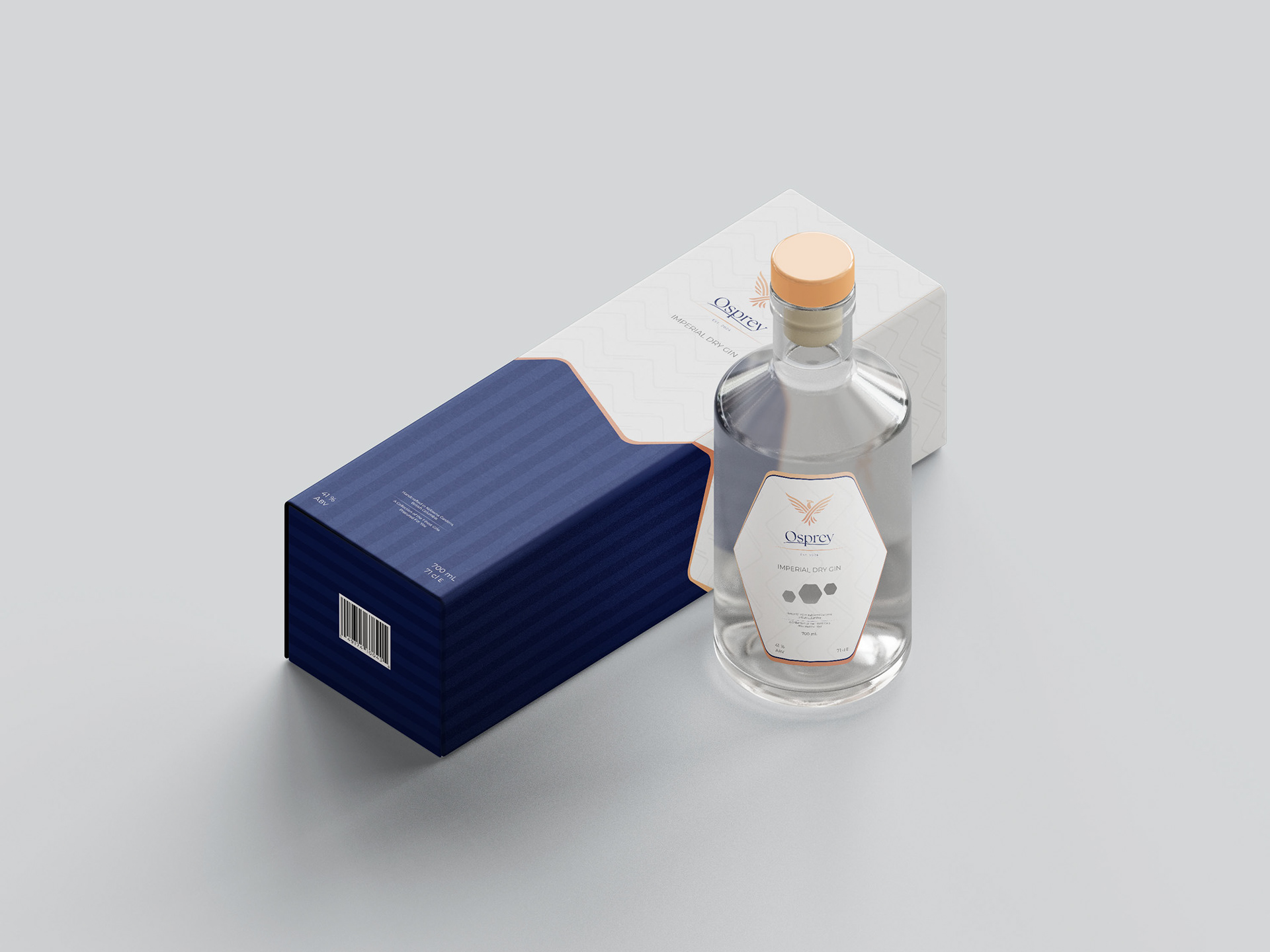
To further solidify the premium feel of the brand, the chosen brand colours include a navy blue, white, and a gradient copper. Navy blue was selected because of its historical symbolism of authority and power of the British Imperial Navy, and Copper was selected as the complimentiary colour because its use in distillery tanks, thus tying the fuctional manufacturing process in with the overall branding.
The Collateral Mockups
The mockups for Osprey Gin are focused on bottle labels, bottle packaging, as well as Point of Sale / Shipping packaging. I wanted to keep the theme of the packaging as elegant and minimalist as to not clutter the design with too much information. This can take away from the premium appearance of the packaging for the consumer.
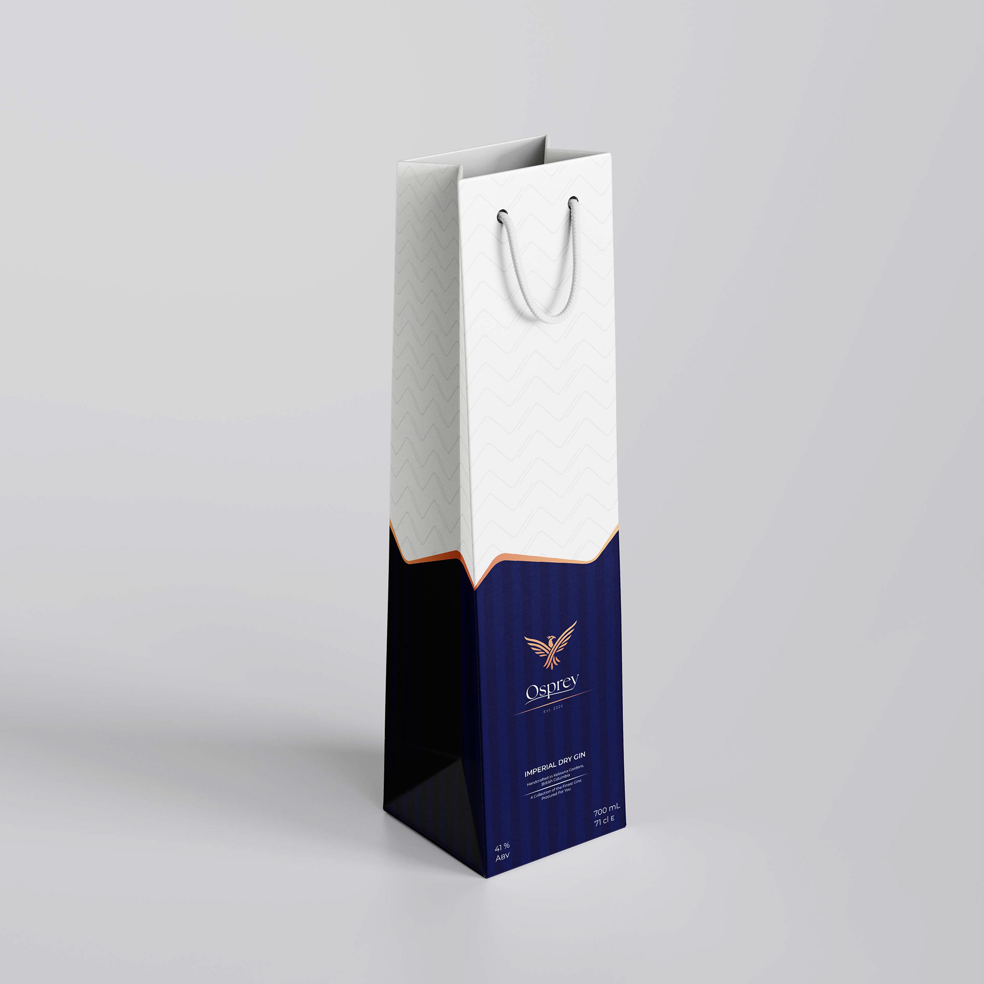
Osprey Gin Gift Bag
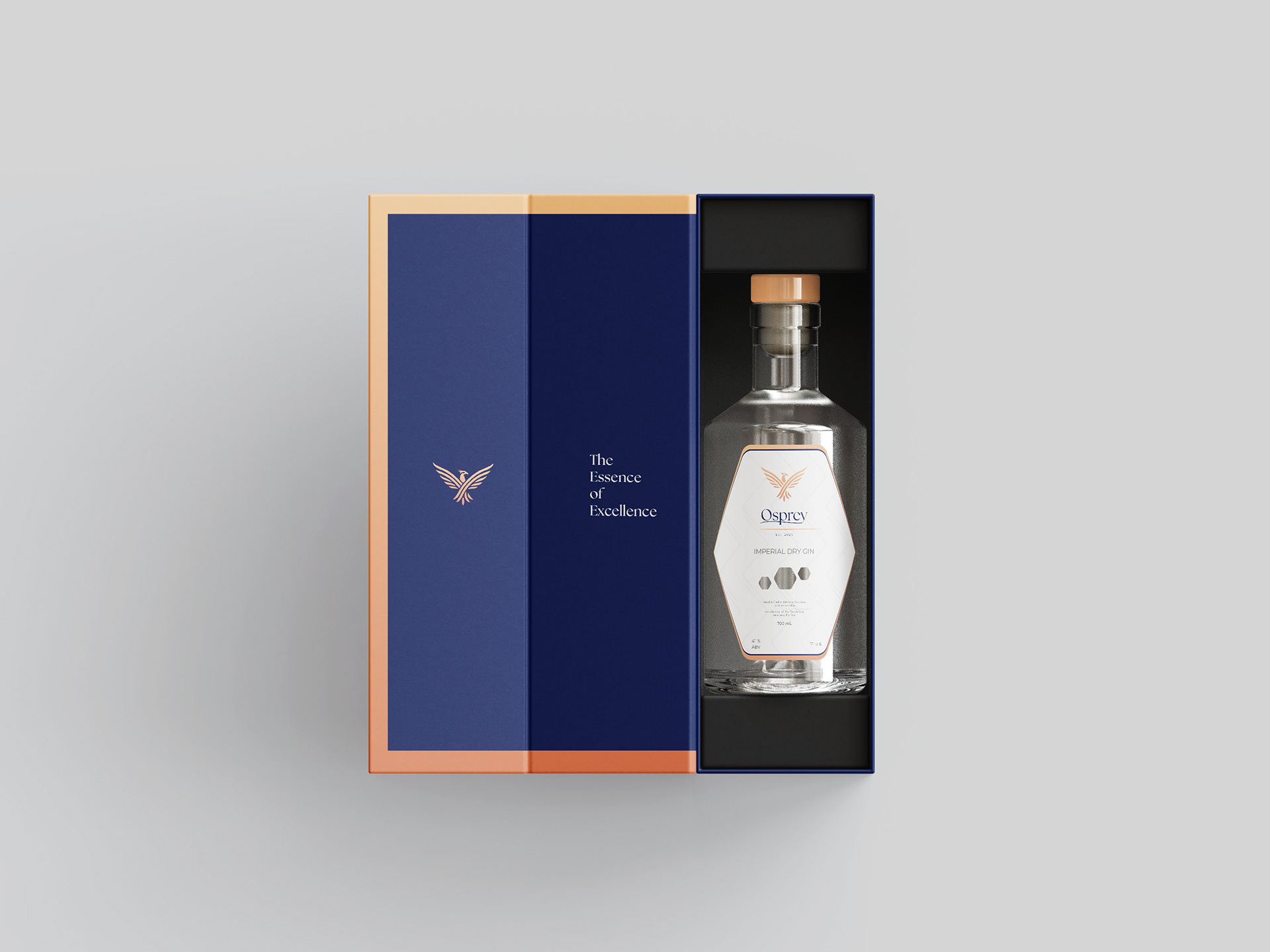
Osprey Gin Bottle In Box
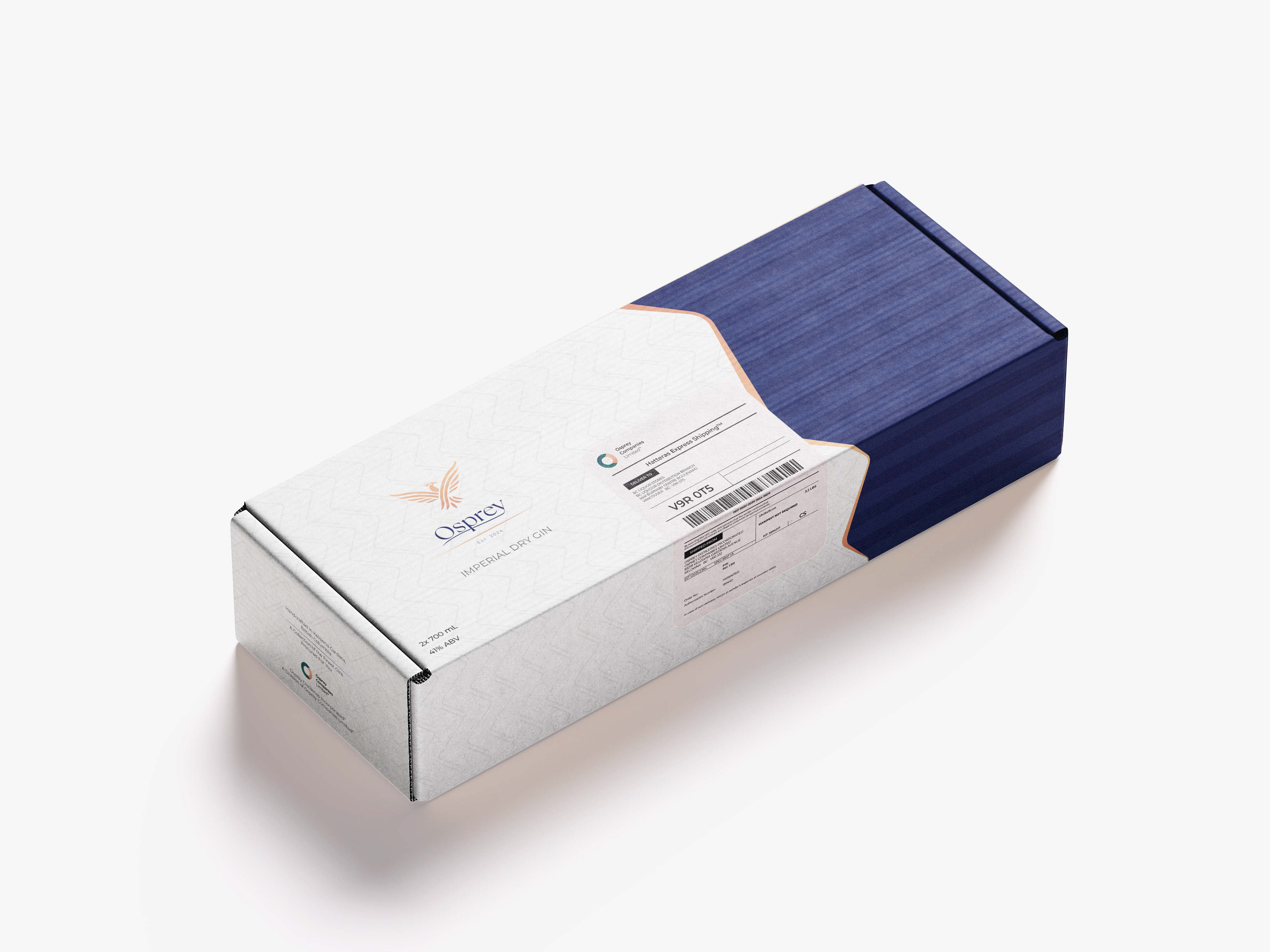
Osprey Gin Shipping Box
Osprey Gin Box On Display
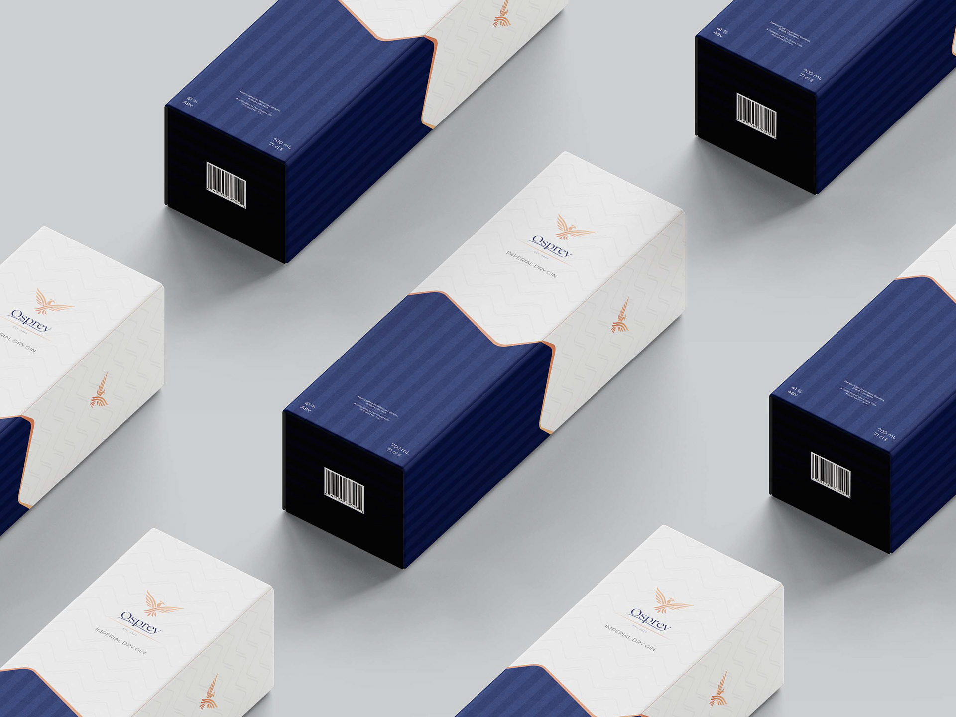
Osprey Gin Boxes Laid Out