The Challenge
As our official introduction into package design, this project walked me through the process of print specifications, the key pieces of information regarding package design and required content, and the best practices when sending package designs to a print shop.
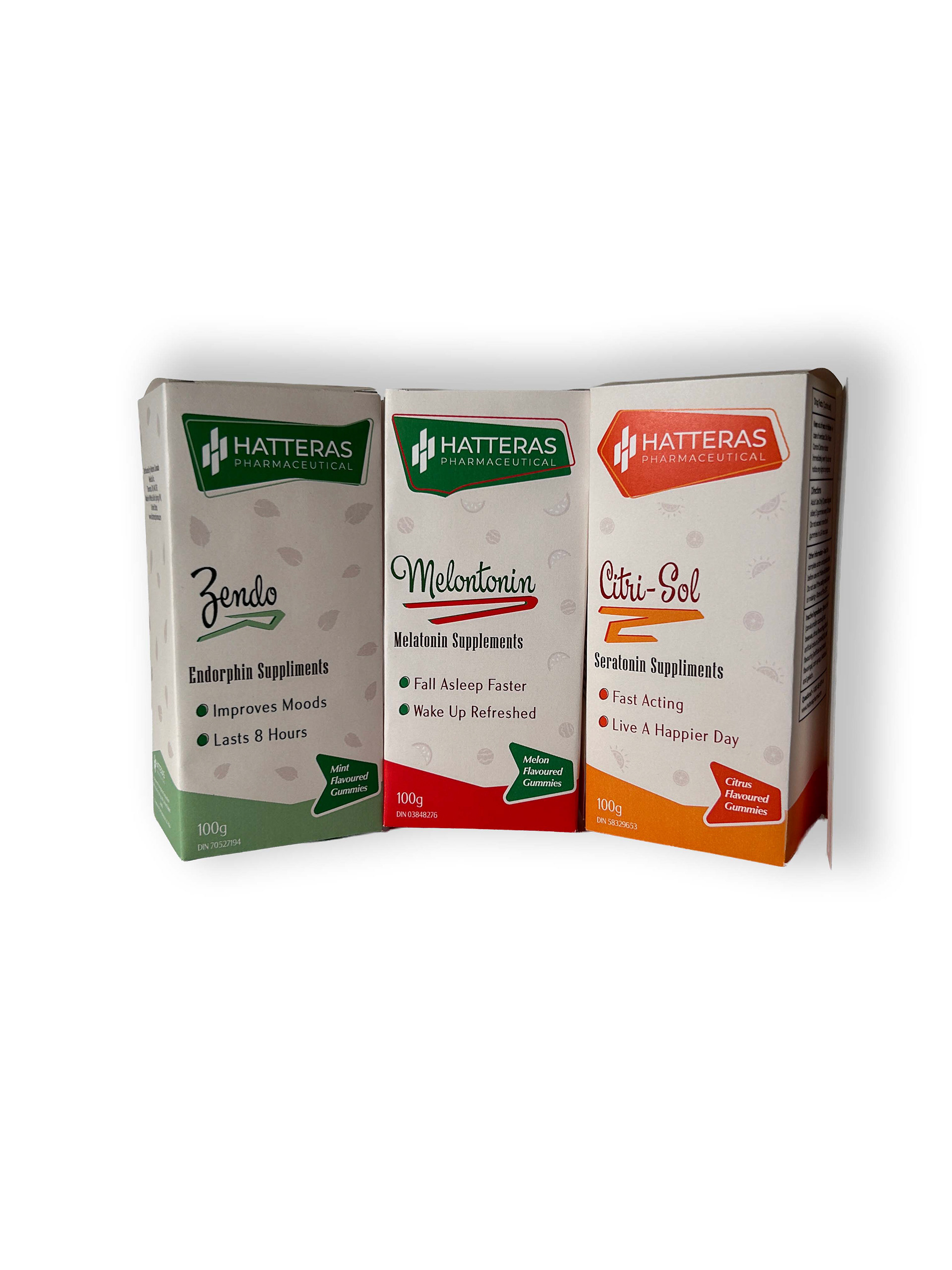
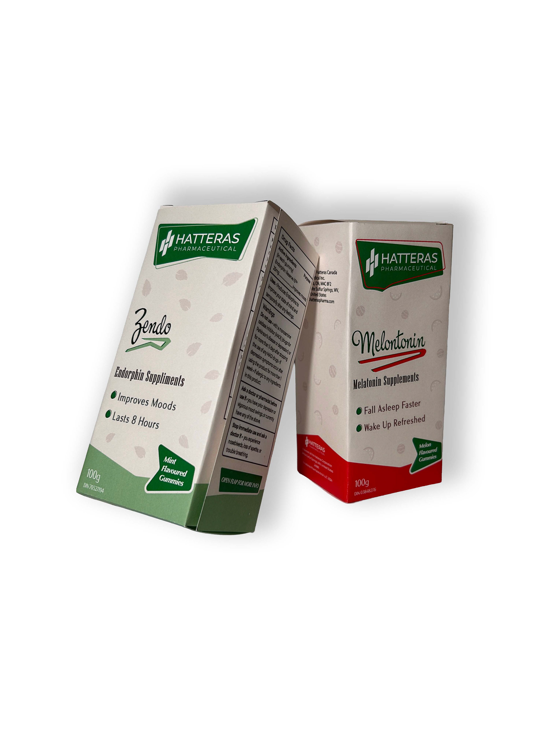
my challenge was to create a series of three package designs for a fictional brand that followed a guiding design principle. I chose to create three medical packages for supplement gummies that follow the Retro guiding design principle.
The Approach
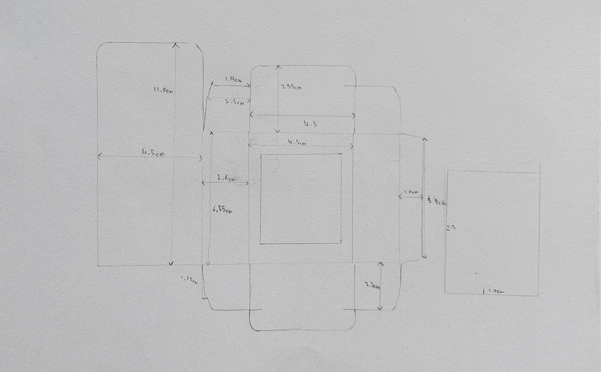
To begin the project, I looked at package designs from the late 50s and early 60s to see what key design elements were used in their designs. Once I had an idea of what elements to incorporate into my package designs to replicate the look of 1950s-60s packaging, I mapped out the layout and sketched in roughly where the information would be placed.
The final part of the design process was finding a way to effectively communicate the various flavours to the consumer without losing too much real estate space for the legal information required for all medical packages.
Mood Board

Reference Sketch & Drafts
I first mapped out the box dimensions of similar products to visualize how much room there was for the text elements. The design elements are reminiscent of the designs used for large storefront signage and print materials during the 50s and 60s.
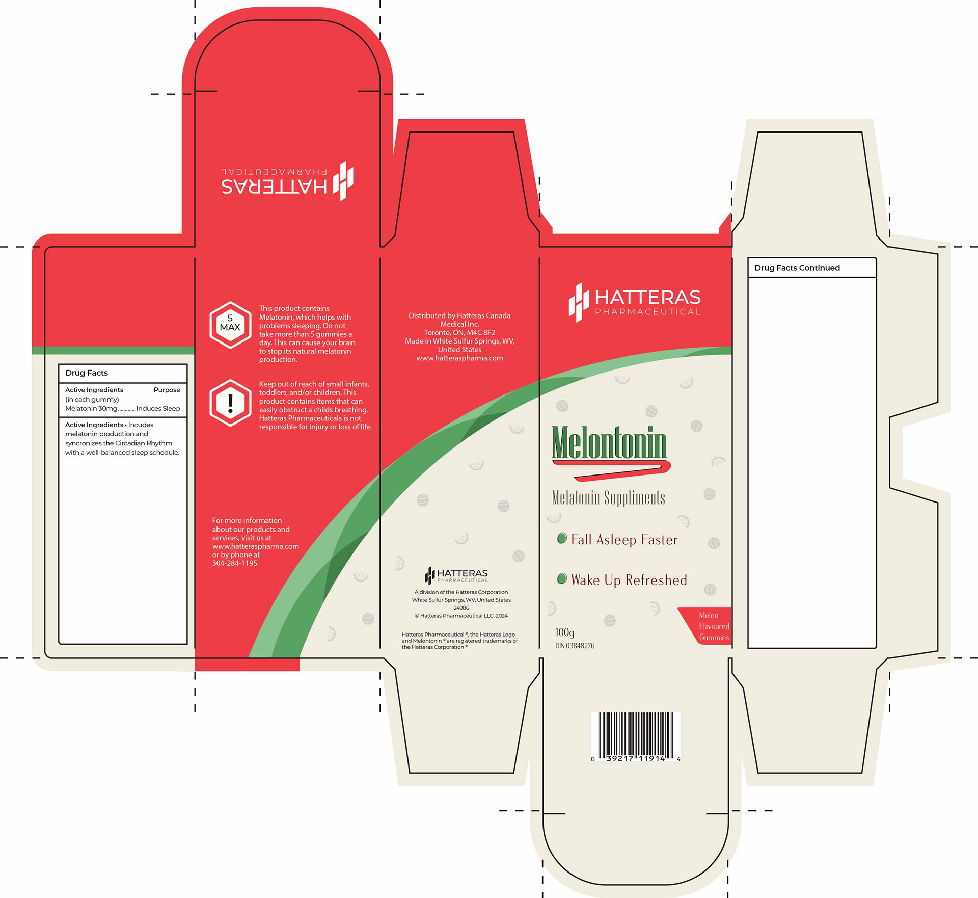
Before Revisions
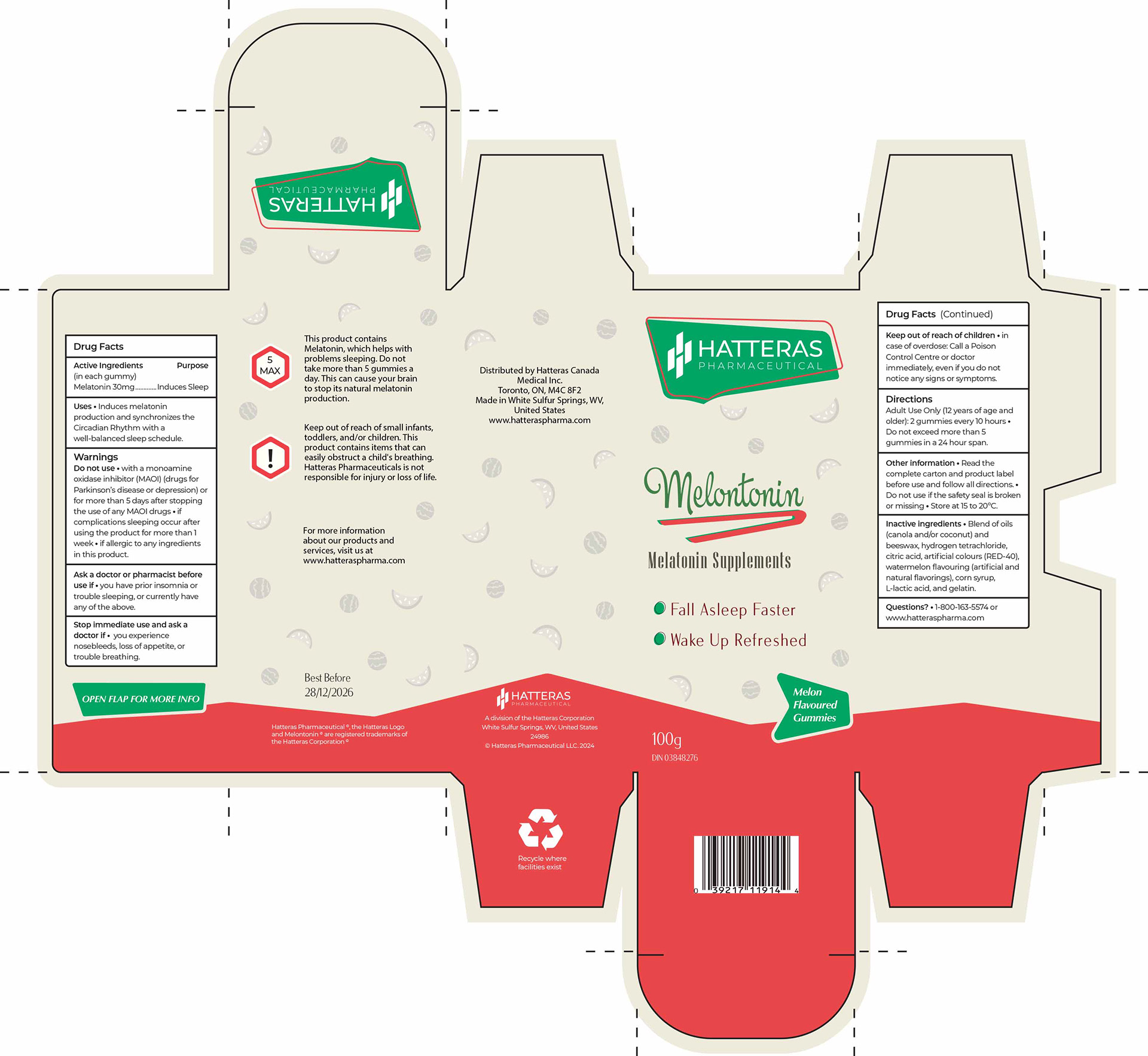
After Revisions
The Final Versions
I opted for a pale beige backdrop to give the design some discolouration, and opted for a vibrant pastel and desaturated colour palette that both gave the distinction of being retro-inspired, and tells the consumer what flavour the gummies are. Red and Green represent watermelon, Orange and Tangerine represent the citrus flavour, and a Green colour palette represents mint.
To make the flavours of each product more visible, I created small graphics like watermelon slices, oranges, and leaves to help elevate and give a subtle visual clue as to the flavour. Each package design has unique boxes surrounding the logo, as well as varied squiggles that highlight the product name.
To ensure that all the necessary and legally required information fits on the package, I incorporated a foldable flap that reveals additional health, ingredient, and legal information required for medicinal products in Canada.
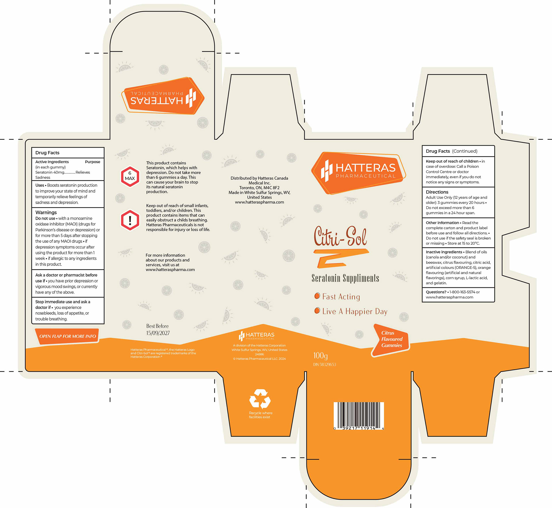
Citri-Sol Package Design

Melontonin Package Design
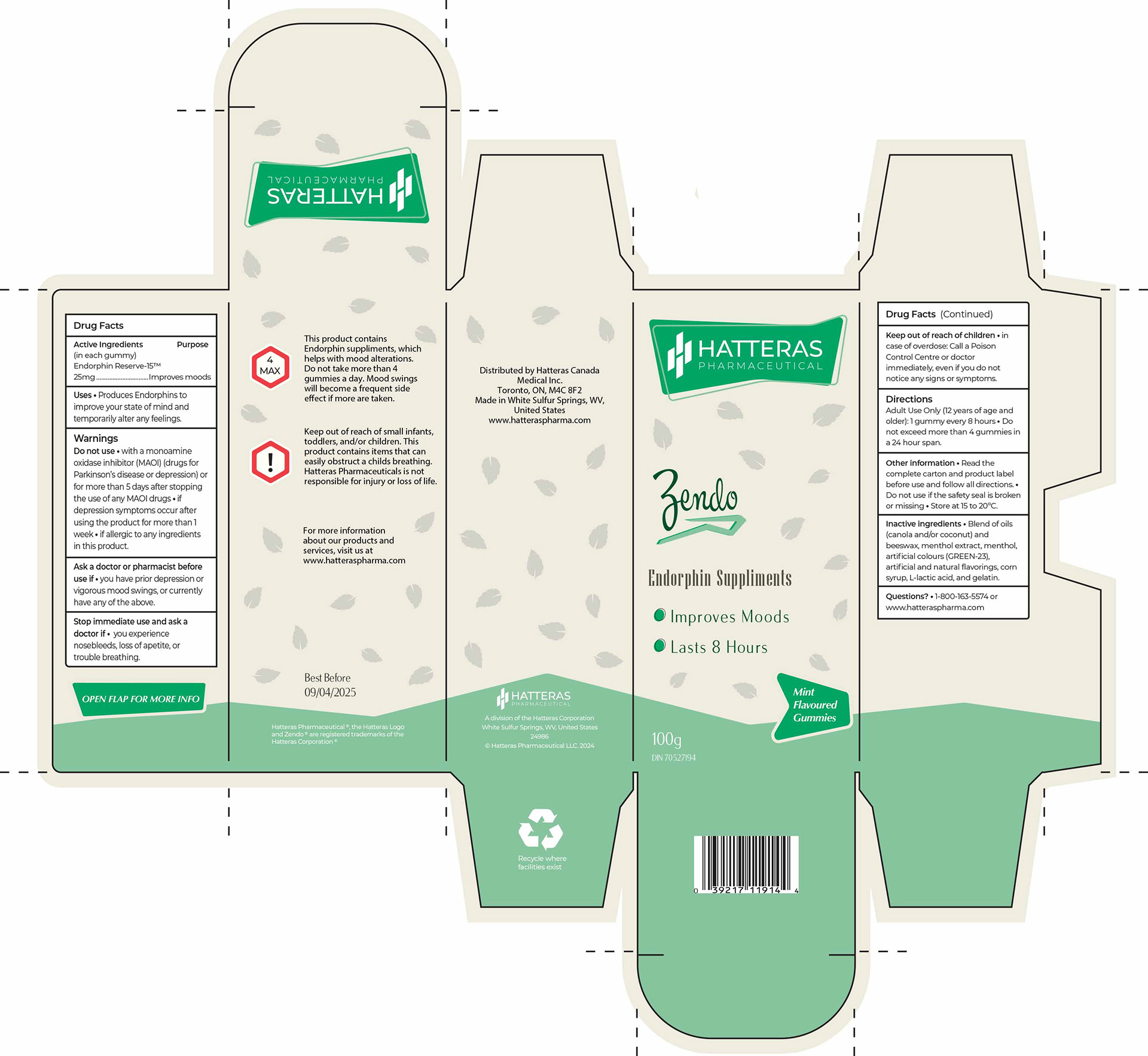
Zendo Package Design
Printed Package Designs
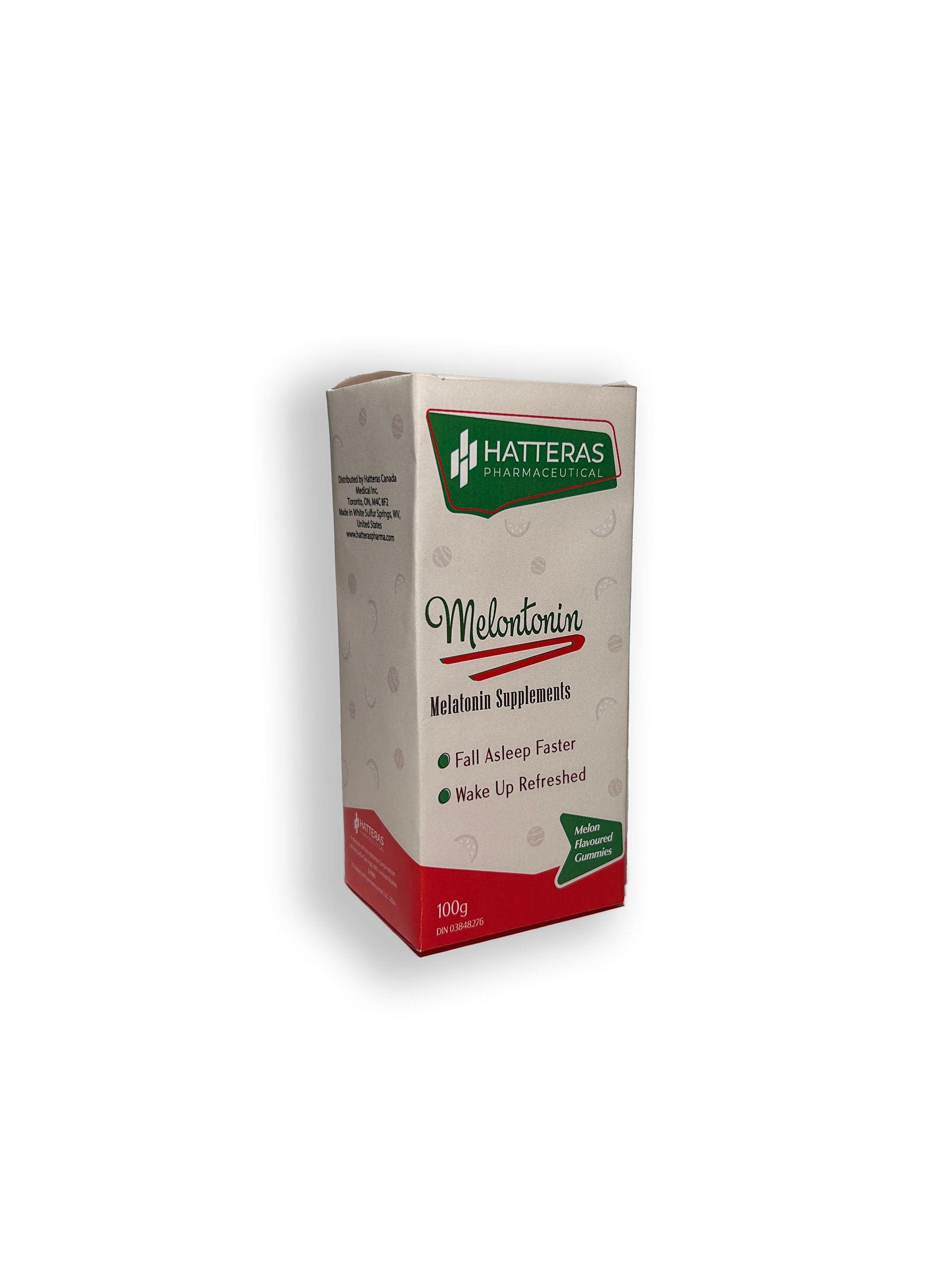
Melontonin Packaging
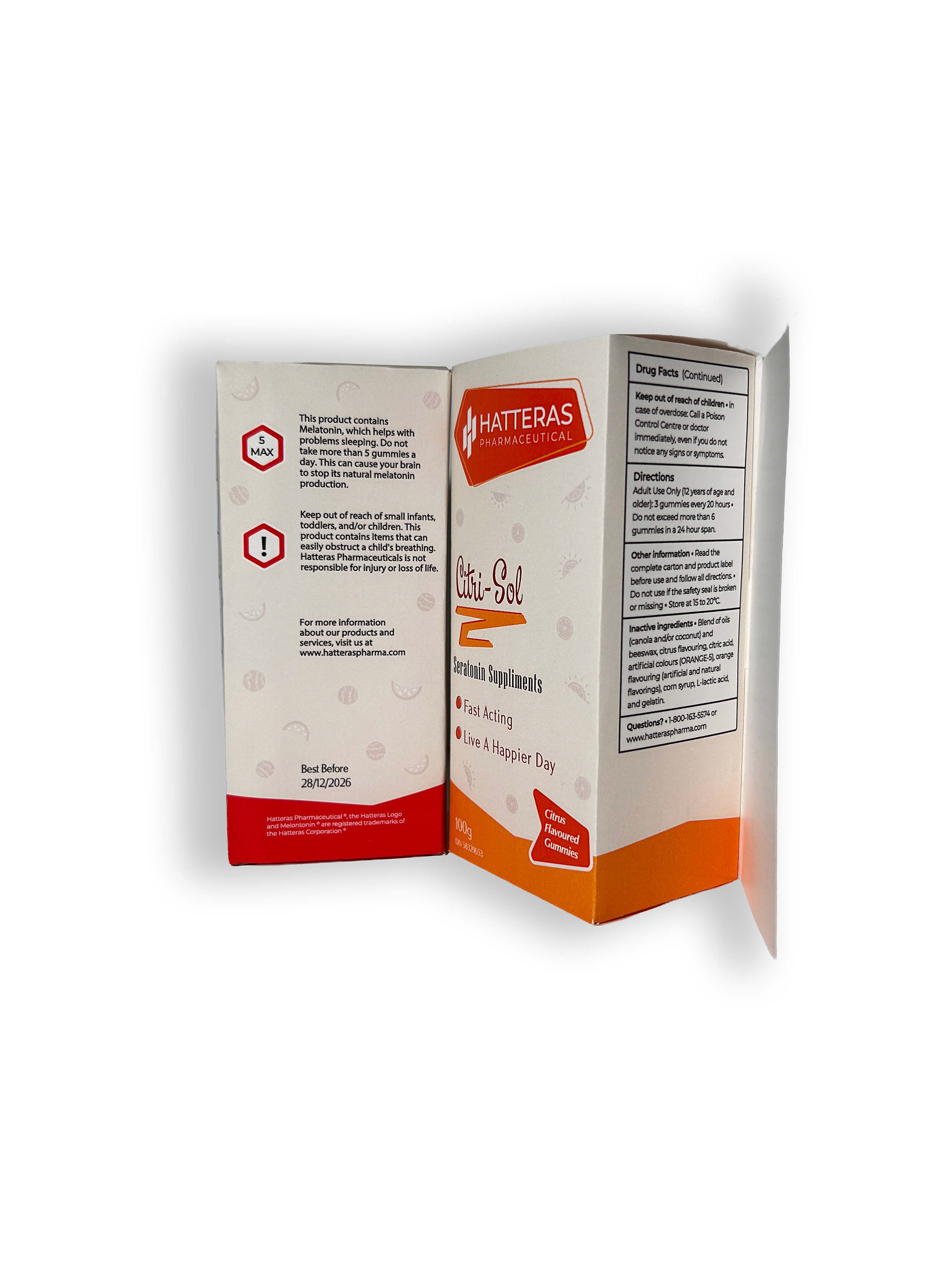
Printed Packages with Open Label
Printed Package Leaning on Box