
The Challenge
The challenge we were given was to design and implement a complete rebrand of a local Vancouver Island-based resort. With this rebrand, we were told to design a new logo suite, brand identity, a suite of collateral mockup assets, three magazine advertisements for the rebrand, and a style guidebook that contains all the work for the rebrand. Each class member was assigned a random resort to complete a rebrand for, and my resort in question was Surf Lodge, located on Gabriola Island.
The Approach
The first set of deliverables for the project was to create a new logo suite for the resort, which included a new primary logo, secondary logo, logotype, and an icon logo variant.
Following the logo assets, the second phase of deliverables was to create a range of collateral mockups for items primarily found in hotels. These mockups serve to showcase the new brand look and any new amenities introduced to the resort.
The final deliverable was to create a style guidebook of the new brand that touches on all the different aspects of the rebrand, including typefaces, brand colours, logos, and collateral mockups.
Logo Sketches & Drafts
I wanted to tie elements of the surrounding environment and scenery of Gabriola Island into the new logo. To give us more inspiration, we were instructed to design a variety of logo sketches using different styles, for instance flora/fauna, architecture, narrative, and geography.
Once we selected our preferred design style, we were to create a further six designs that vary in design, feel, and motif.

Surf Lodge Logo Sketches
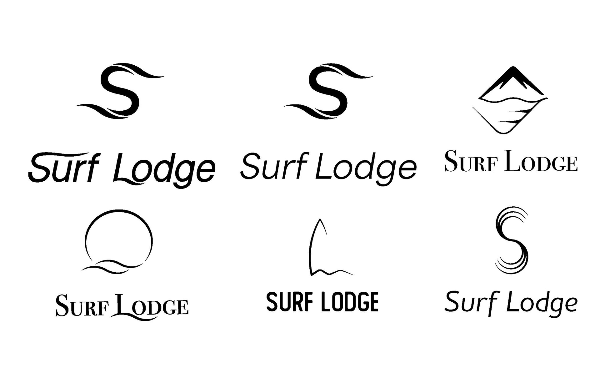
Surf Lodge Logo Drafts
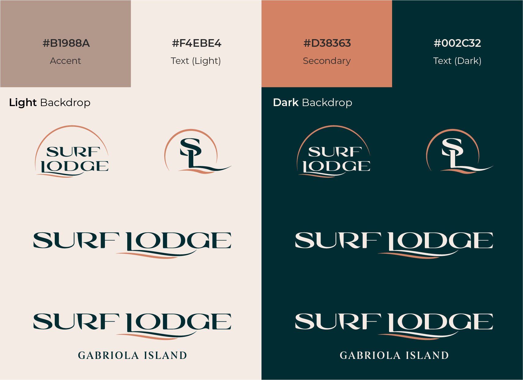
Logo Suite & Brand Identity
After I selected my chosen logo sketch, I developed it into a suite of logo variants. The primary logo includes a thin circle that surrounds the logo which represents the setting sun on the horizon, the arm of the 'L' was stretched and modified to represent waves flowing across the surface of the water, finally I reworked the stem of the 'R' to represent a surfboard fin. In addition to the primary logo, I created a logotype, an monogram logo, and a secondary logotype that can be used in numerous types of media.
The new Surf Lodge brand identity include new brand colours which draw inspiration from the surrounding forest and alpenglow that is visible from the resort. I opted to use a dark teal as the primary colour as the resort is mainly surrounded by forest, and used Sandstone beige colours to compliment the copper orange.
The typography went through considerable changes in order to emulate the feeling of a luxury and premier resort experience. The chosen typeface for the logo is Sought to enhance the new logos refined appearance, and the secondary type is Begum to add another level of sophistication to the logos.
Collateral Mockups
Upon completing the logo suite, the next step of the project was to begin consolidating and designing a handful of mockups that display and showcase the new branding of te resort. For the mockups, we selected a range of different items that are most commonly found in and around a resort, as well as a few niche mockups that can elevate and add character to the brand.
I chose to design a beverage coaster, a door hangar, a room keycard, an employee ID badge, a Front Desk information stand, a drinks menu, a pair of nametags, a ballpoint pen, a set of tabletop hotel information stands, shower amenity labels, office stationery, a beach towel, and a vintage car.
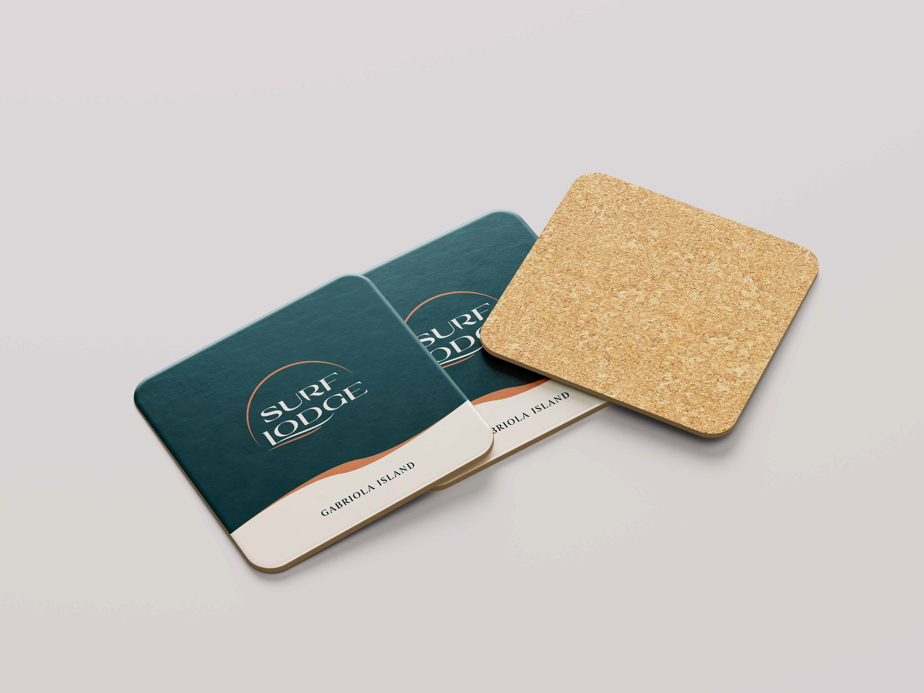
Drink Coasters
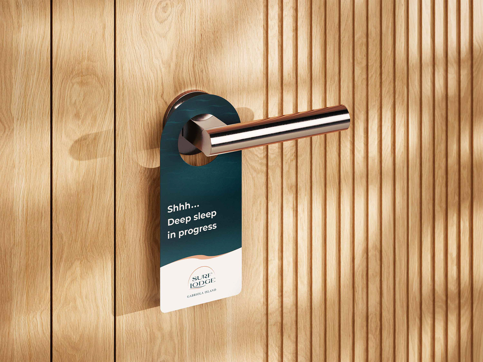
Do Not Disturb Sign
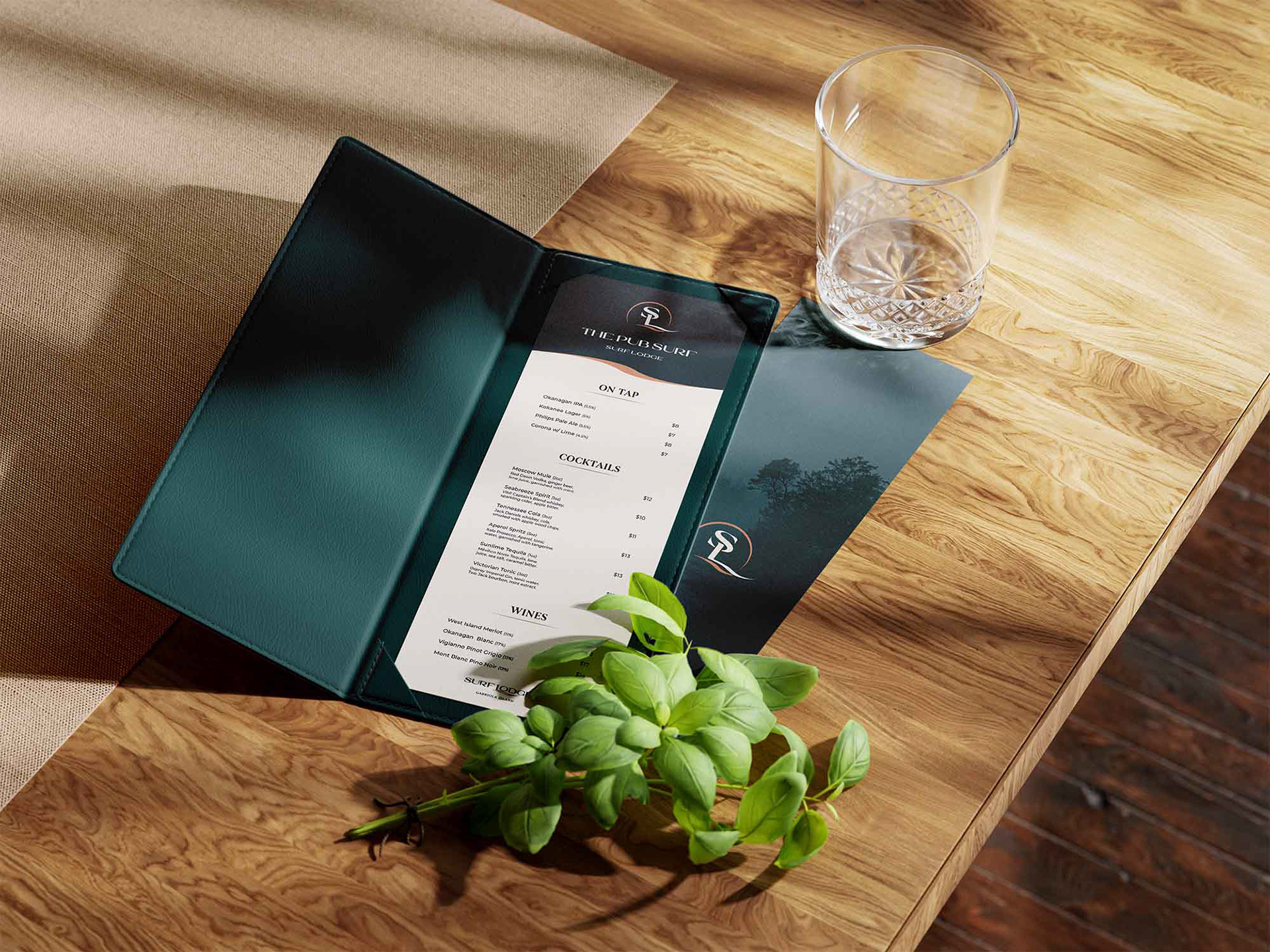
Drinks Menu
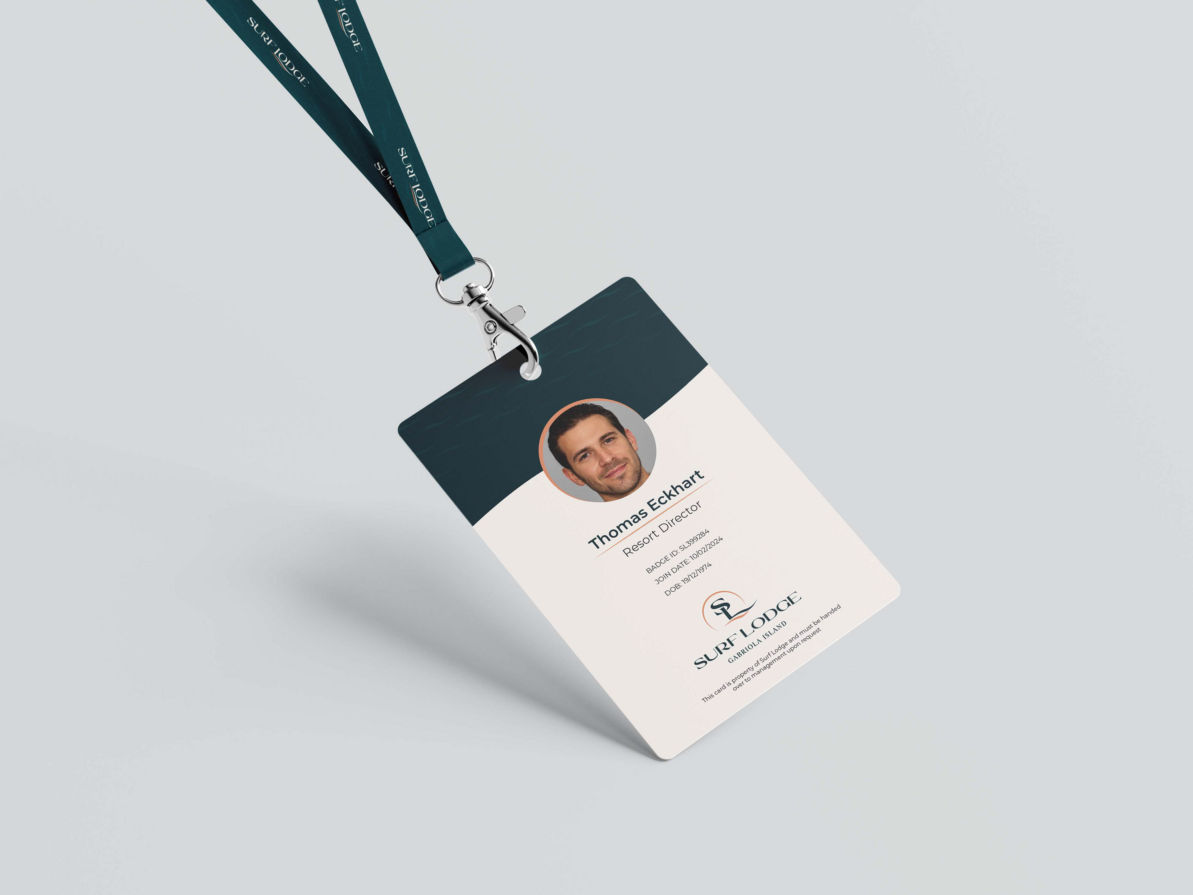
Employee ID Card
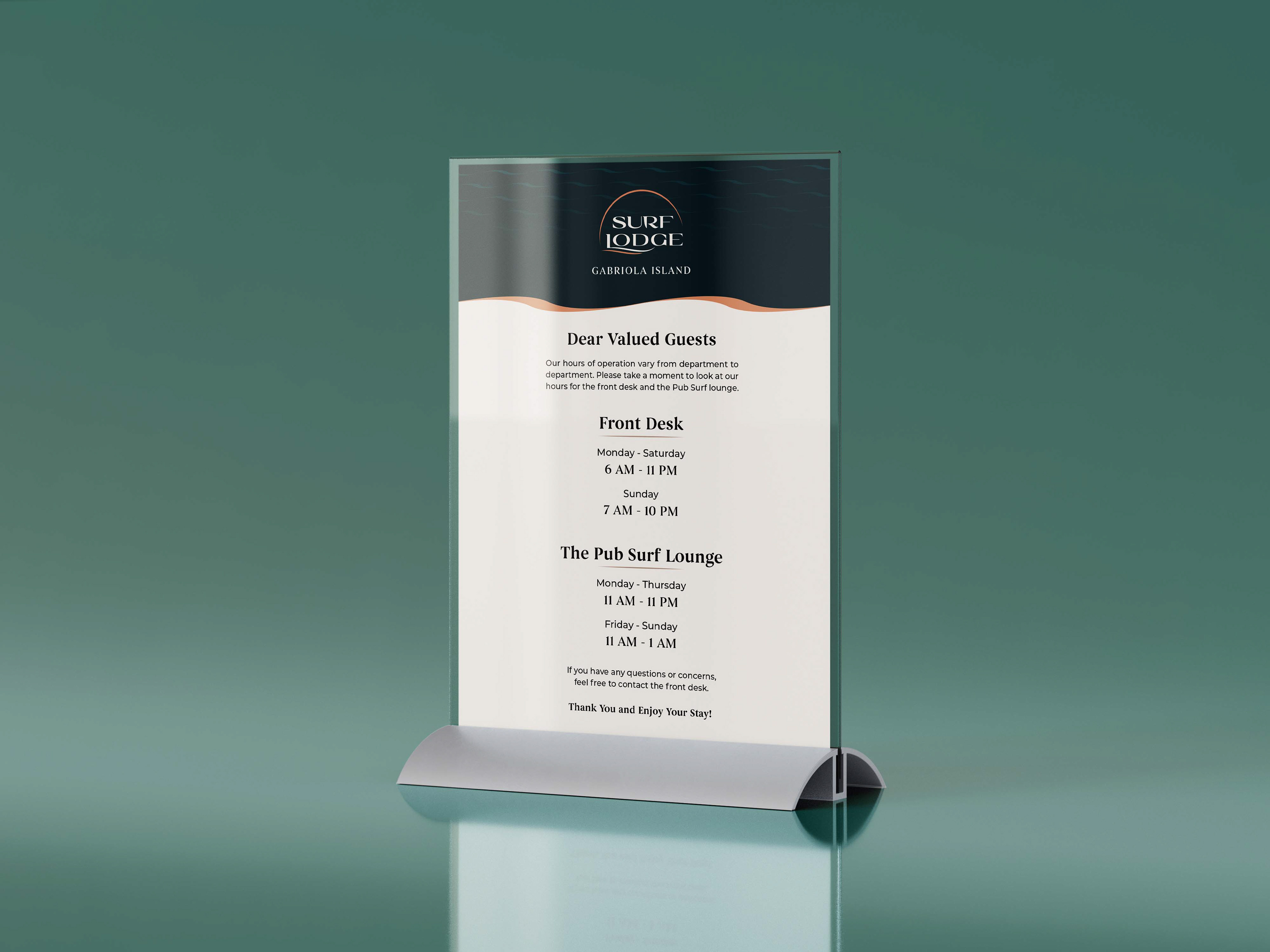
Resort Information Sign
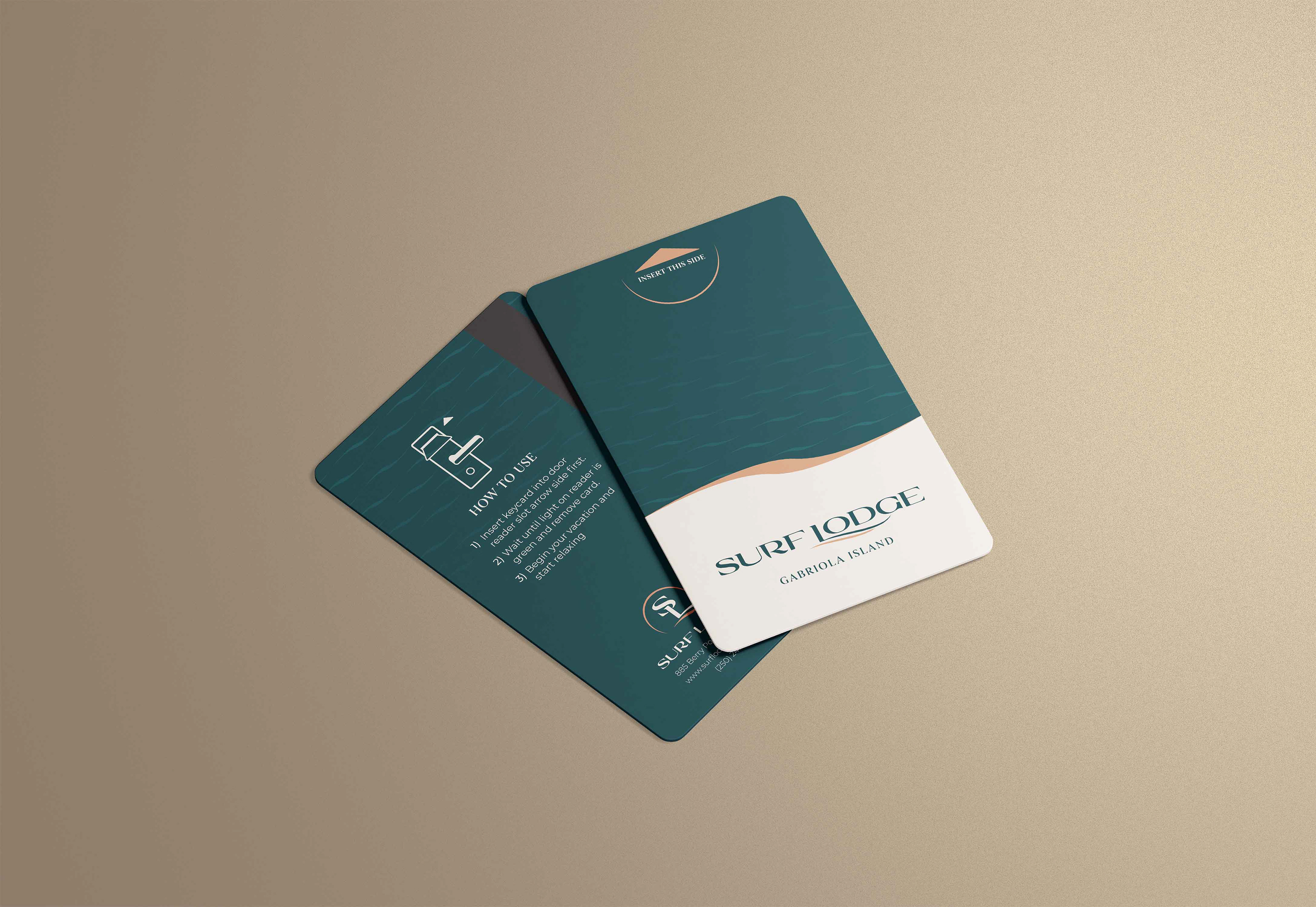
Room Keycard
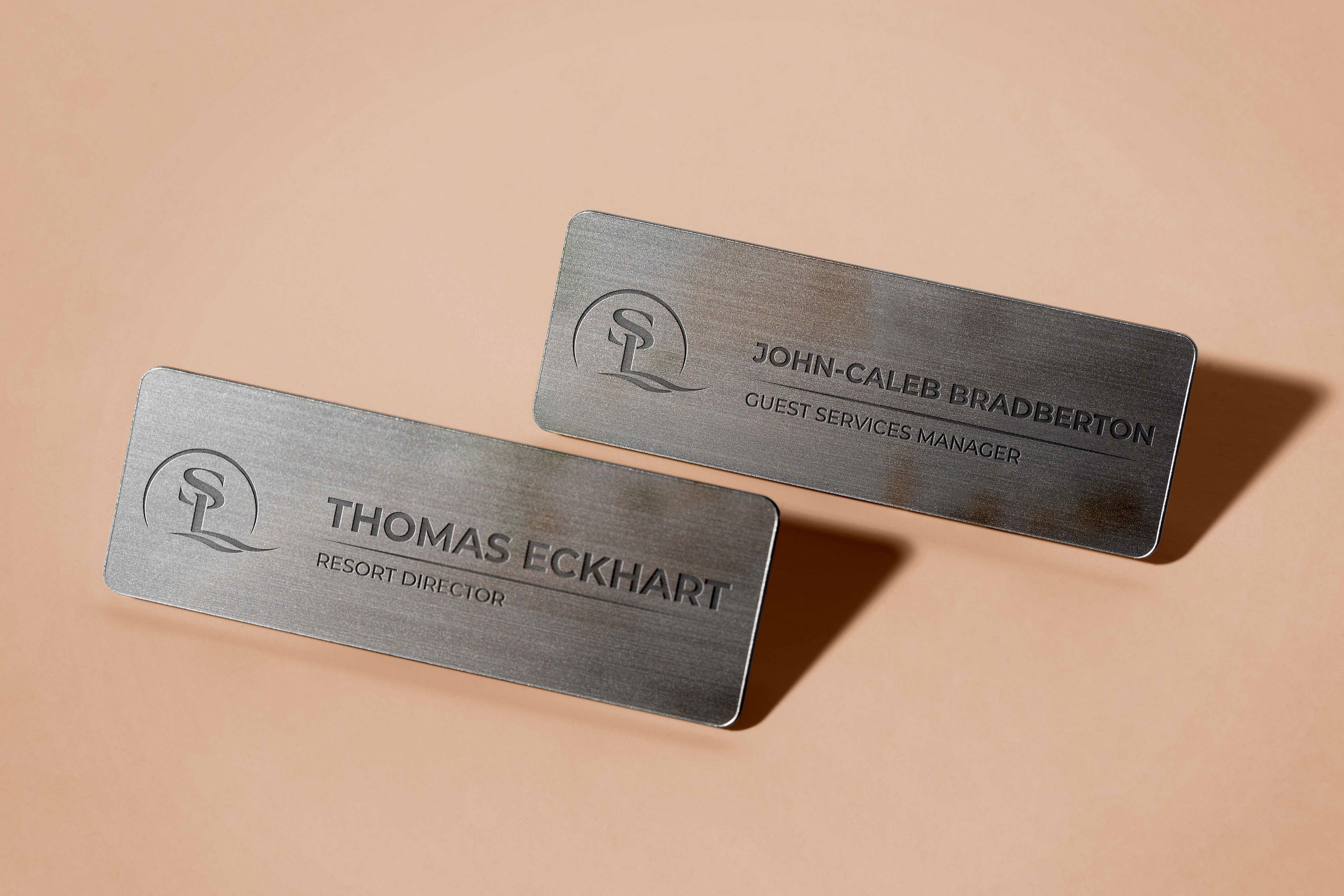
Employee Name Tags
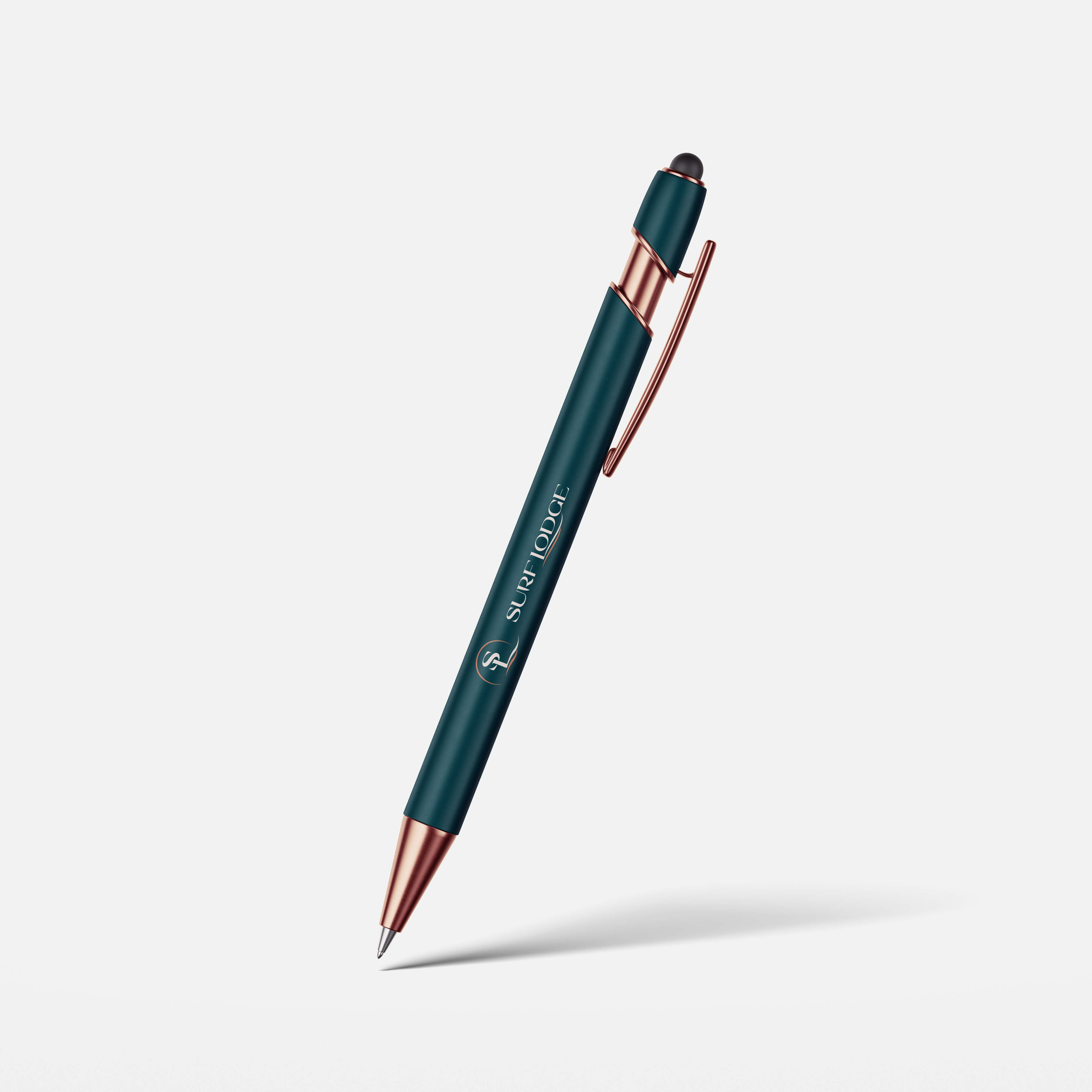
Ballpoint Pen
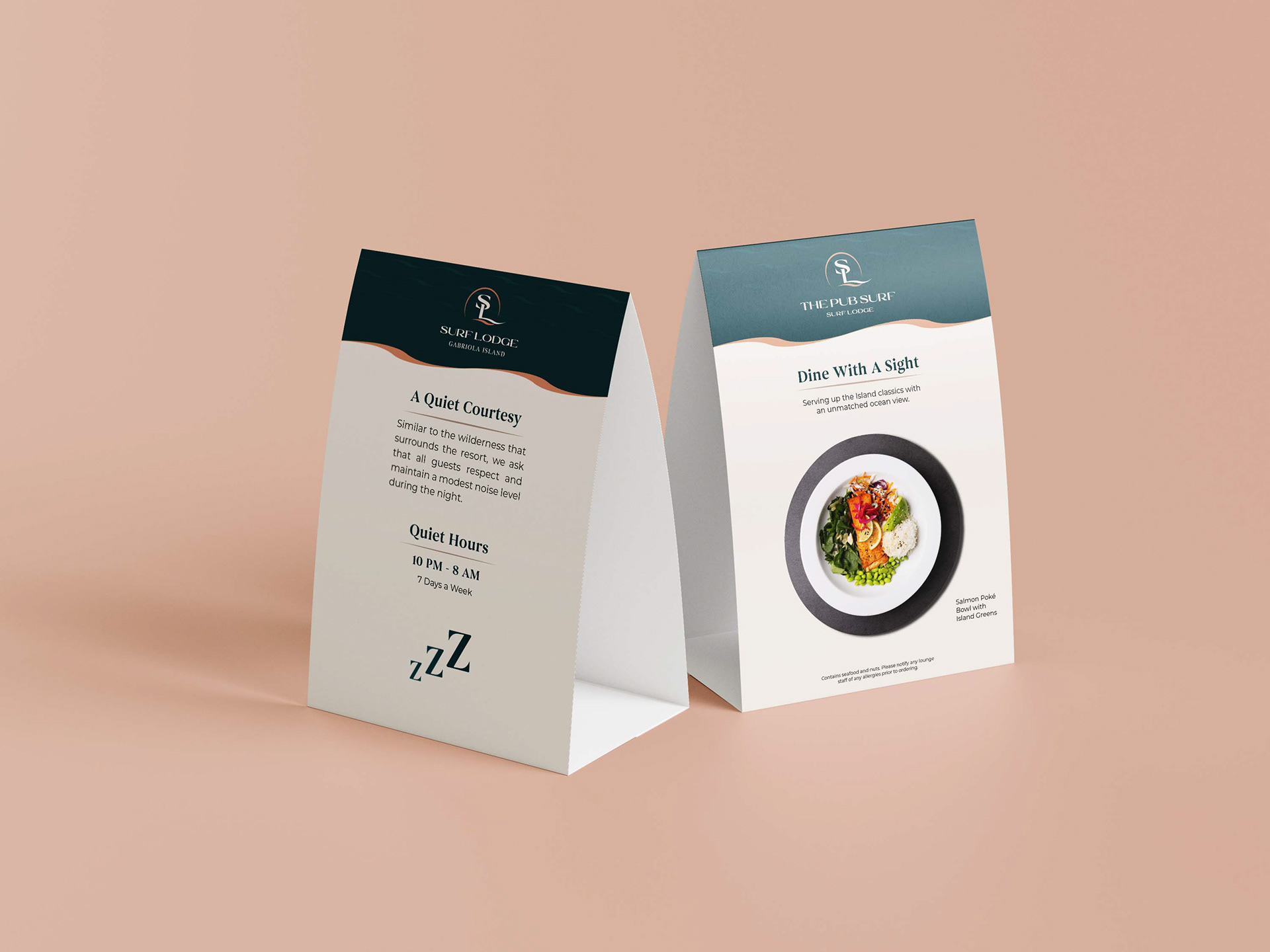
Guest Information Sign
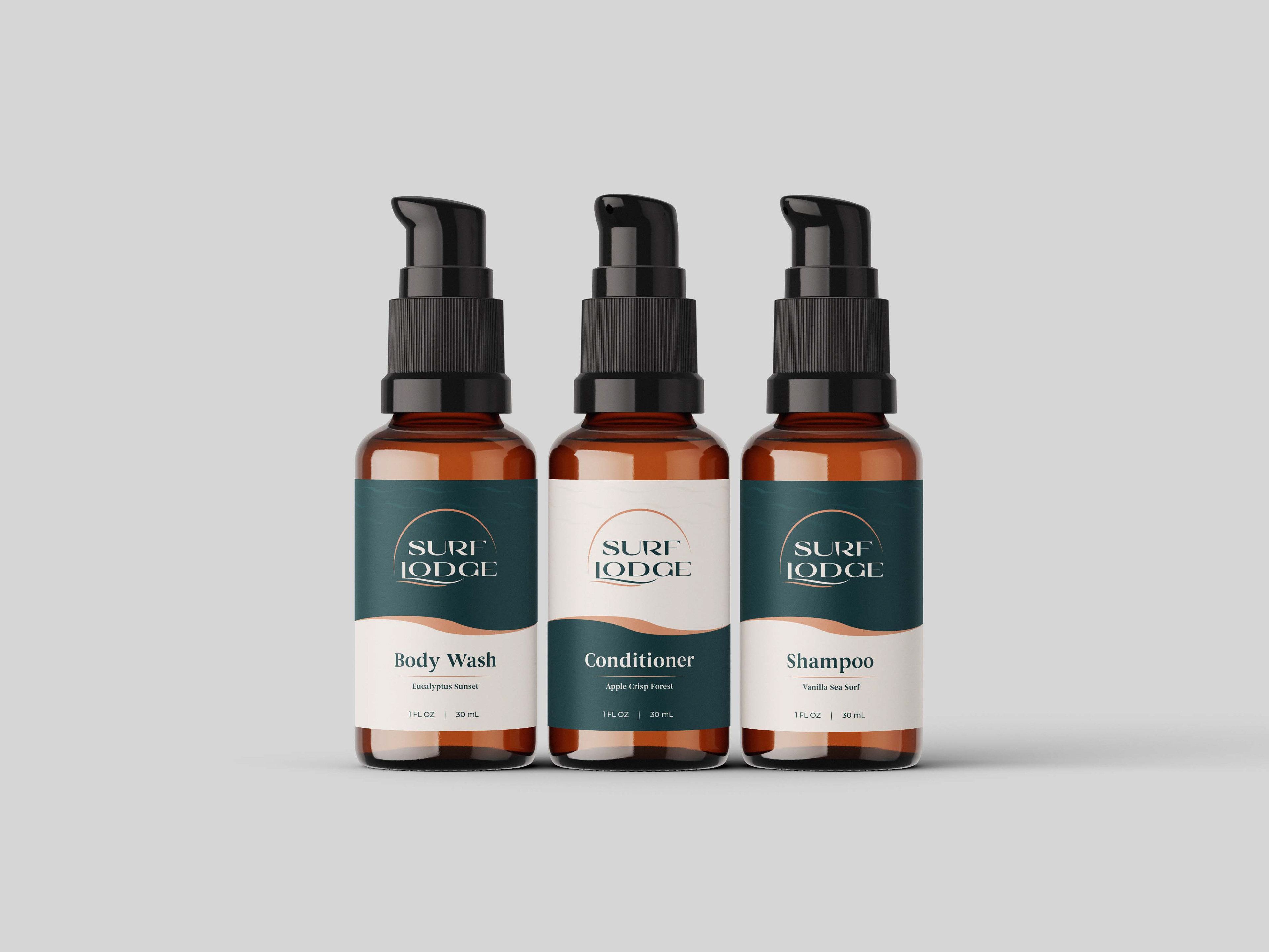
Amenities Bottles

Office Stationery
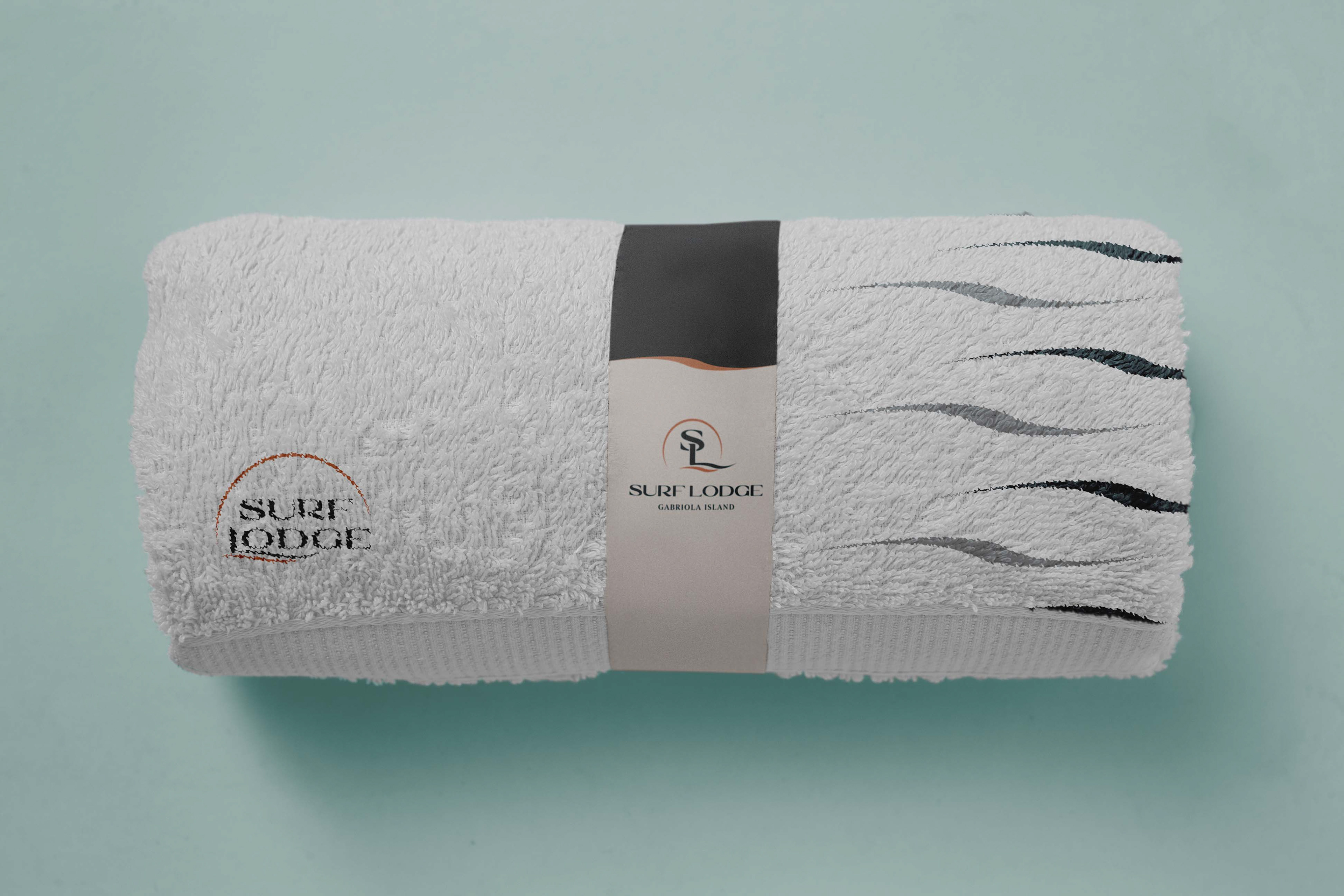
Beach Towel
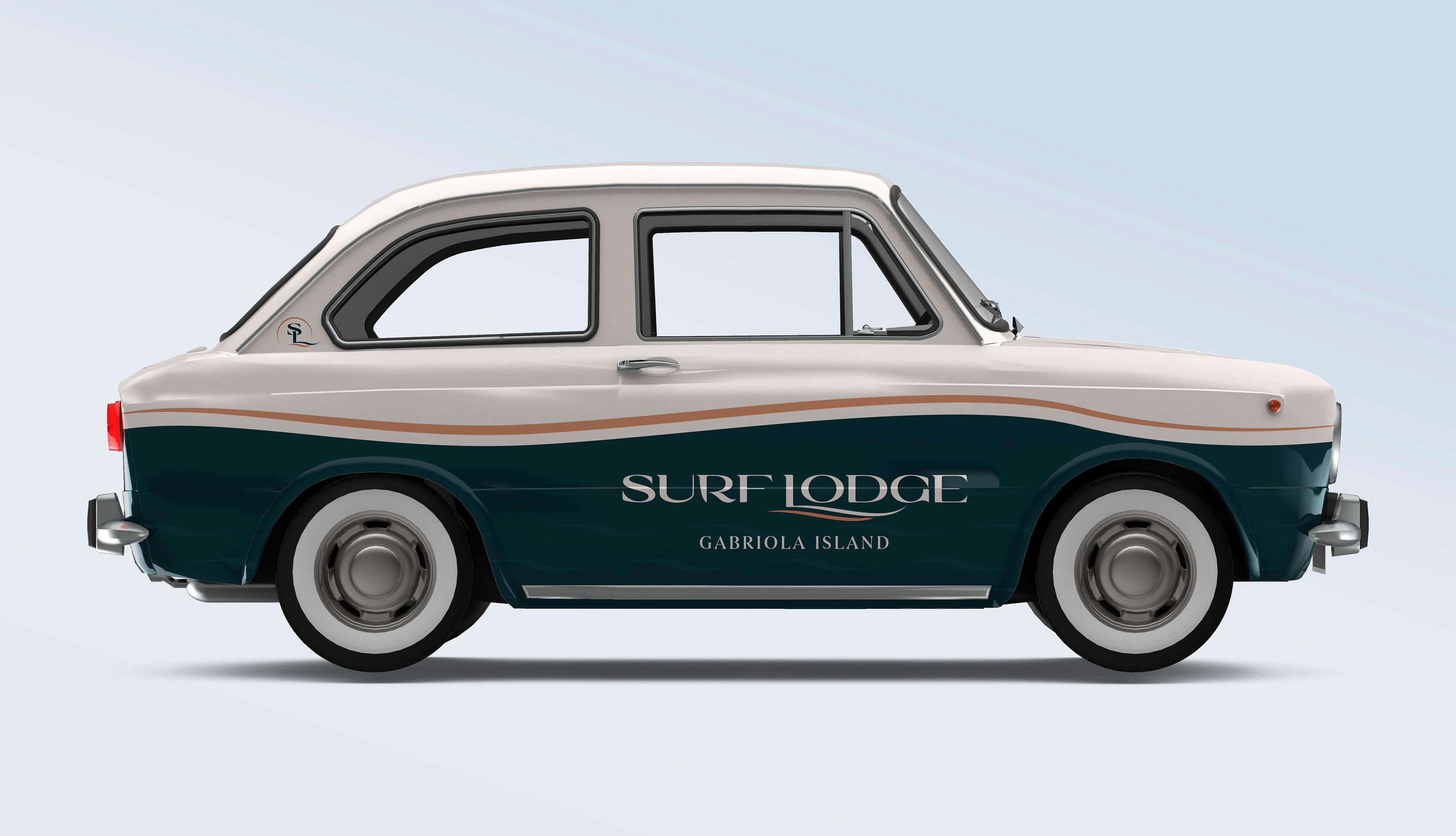
Vintage Car
Print Advertisments
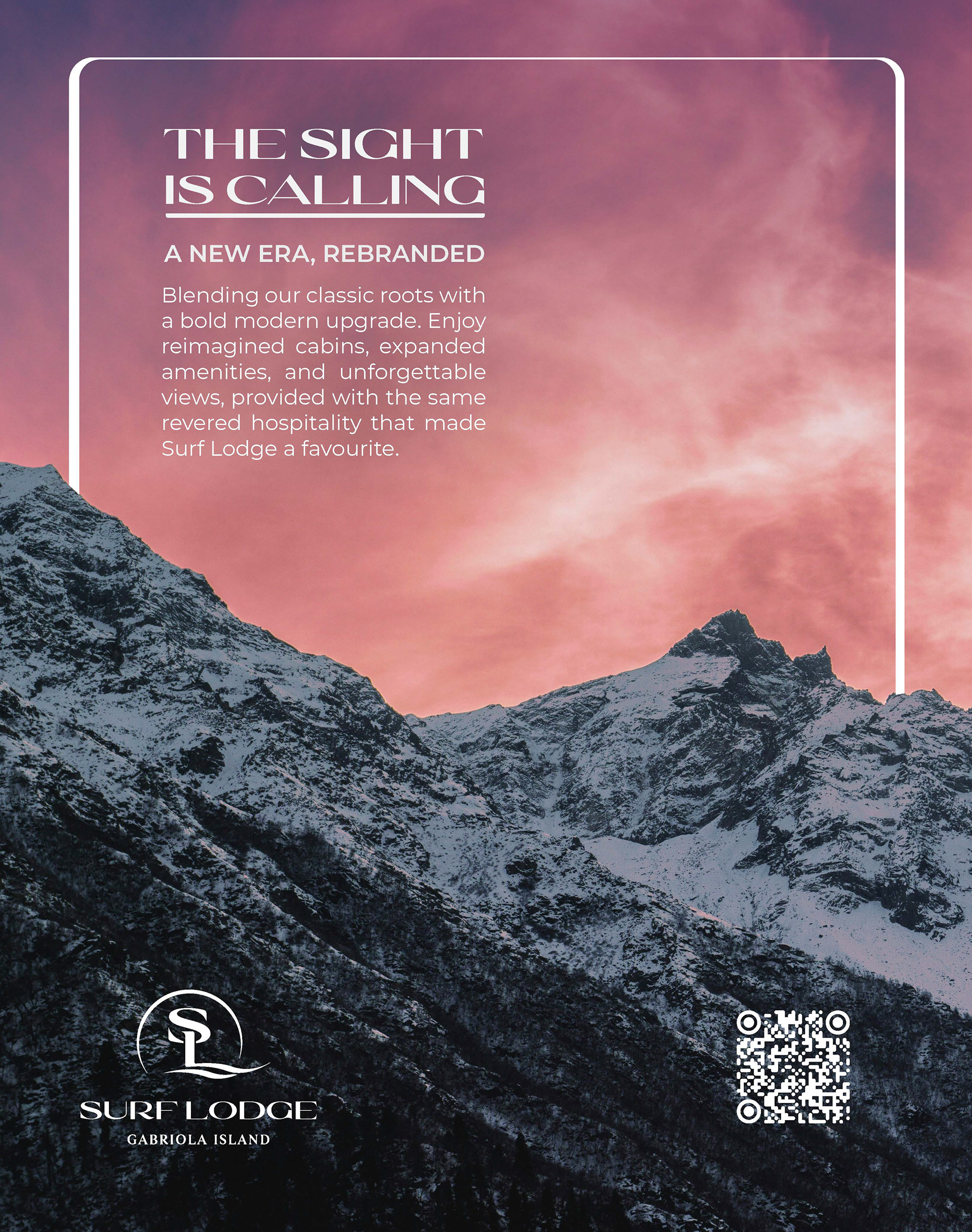
The print advertisments are designed to create buzz surrounding the new rebrand of our resorts. To continue with the luxury feel of the rebrand, the advertisments utilize as much space for the photogaphy and as little space for the information and content without losing its hierarchy. To convey to the reader that it is a Vancouver Island based resort, I opted to use scenic photogaphy taken from different parts of the island that guests are most likely to visit, places such as Tofino, Gabriola Island, and Mount Washington.
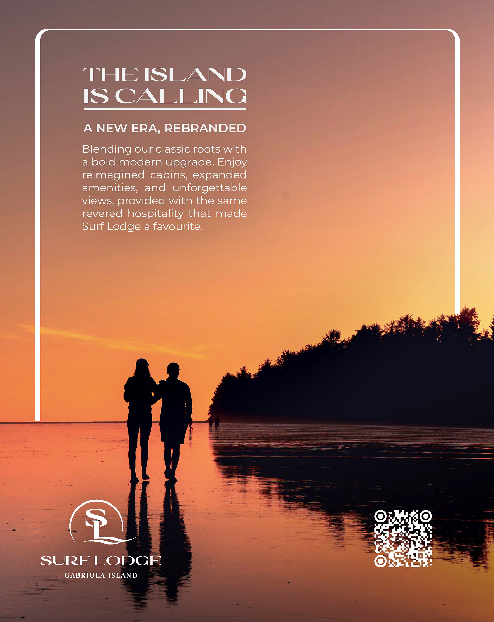
Surf Lodge Rebrand Advert
Surf Lodge Rebrand Advert

Surf Lodge Rebrand Advert
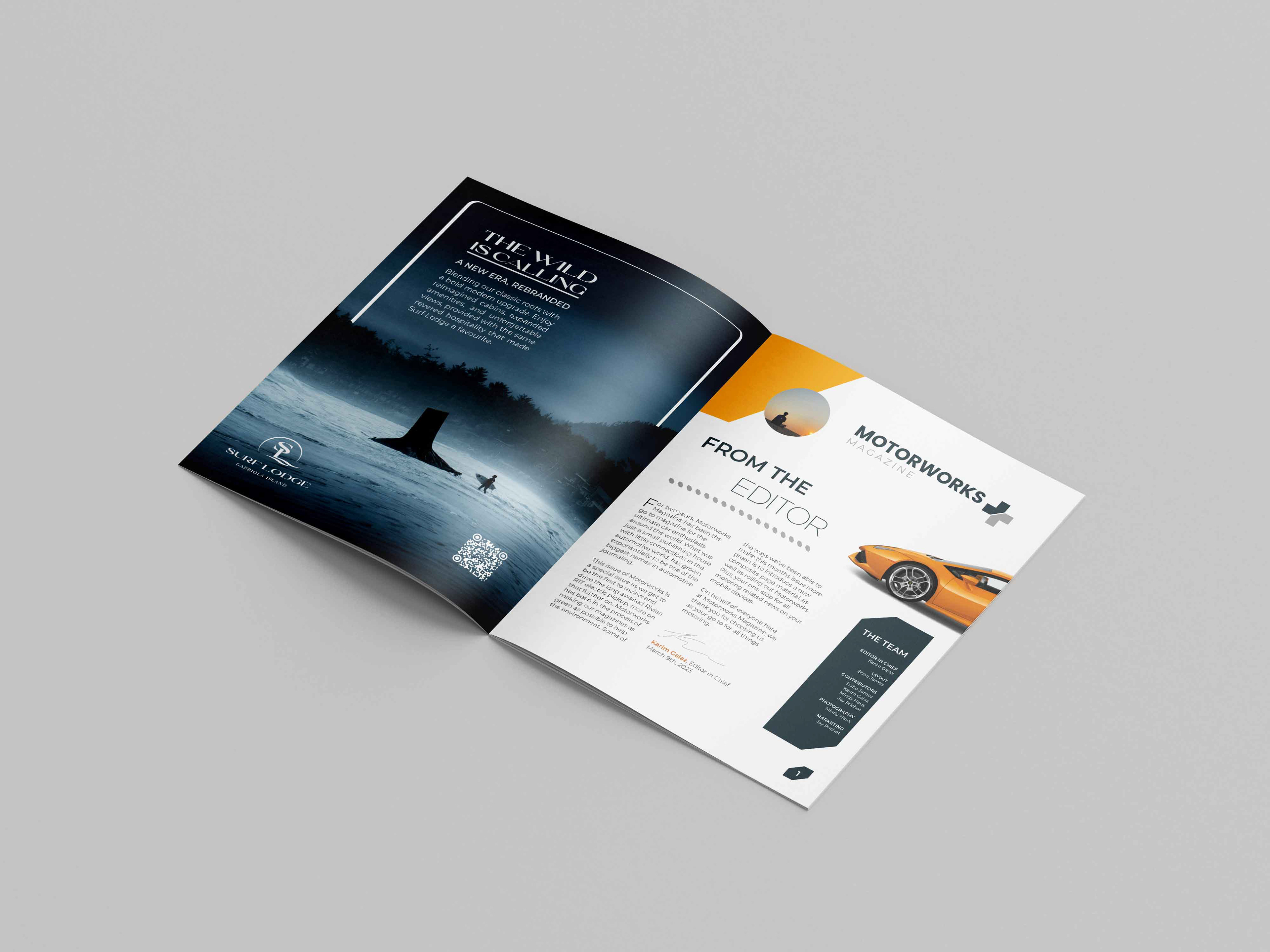
Surf Lodge Rebrand Advert Mockup
Brand Style Guidebook
The final part of the project was to create a complete brand style guidebook that guides the reader through the rebrand of the resort. The guidebook includes the inception of the rebrand, logo suite, brand colours & typography, and the collection of collateral assets created for the rebrand.
See the complete brand guidebook by clicking the button below.