
The Challenge
The challenge for this project was to create a fully functional mobile app mockup using Figma. For the applications, we were given a choice of selecting a real-life brand with an app that was in need of dire updates to its UI/UX interface, or to create an innovative app for a fictional brand. I chose to create a vacation property booking app for a real-life brand called Whistler Superior Properties, based in Whistler, BC.
The Approach
To get an idea of what layout I wanted to utilize for my app, I investigated the various competing applications such as VRBO, Expedia, and Tripadvisor. I took notes on the similarities across the different apps, as well as any unique features that stood out from its competition, for example; dynamic property pricing or building a travel itinerary directly on the app.
Because this app would be for Whistler Superior Properties, I wouldn't be able to design a dynamic pricing feature for the properties as they operate all the properties listed on the app. However, I would be able to integrate a travel guide feature that recommends restaurants, eateries, activities, and shopping within Whistler Village and neighbouring Creekside.
I took as many design elements from their existing website to create a moodboard to get an idea of what style and feel I wanted to incorporate into the apps design. The strong use of blues and a clean, organized layout were the main goals of the design process.
The Process wireframes
I began with laying out all the content boxes and other essential elements on a series of empty Figma frames to begin building the foundation for the apps interface and adjusting all the content boxes to fit accordingly.
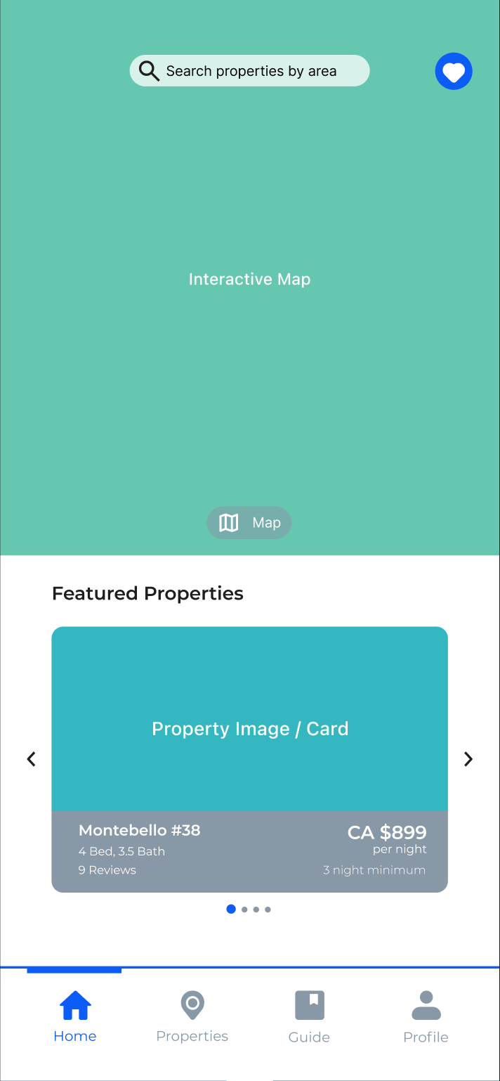
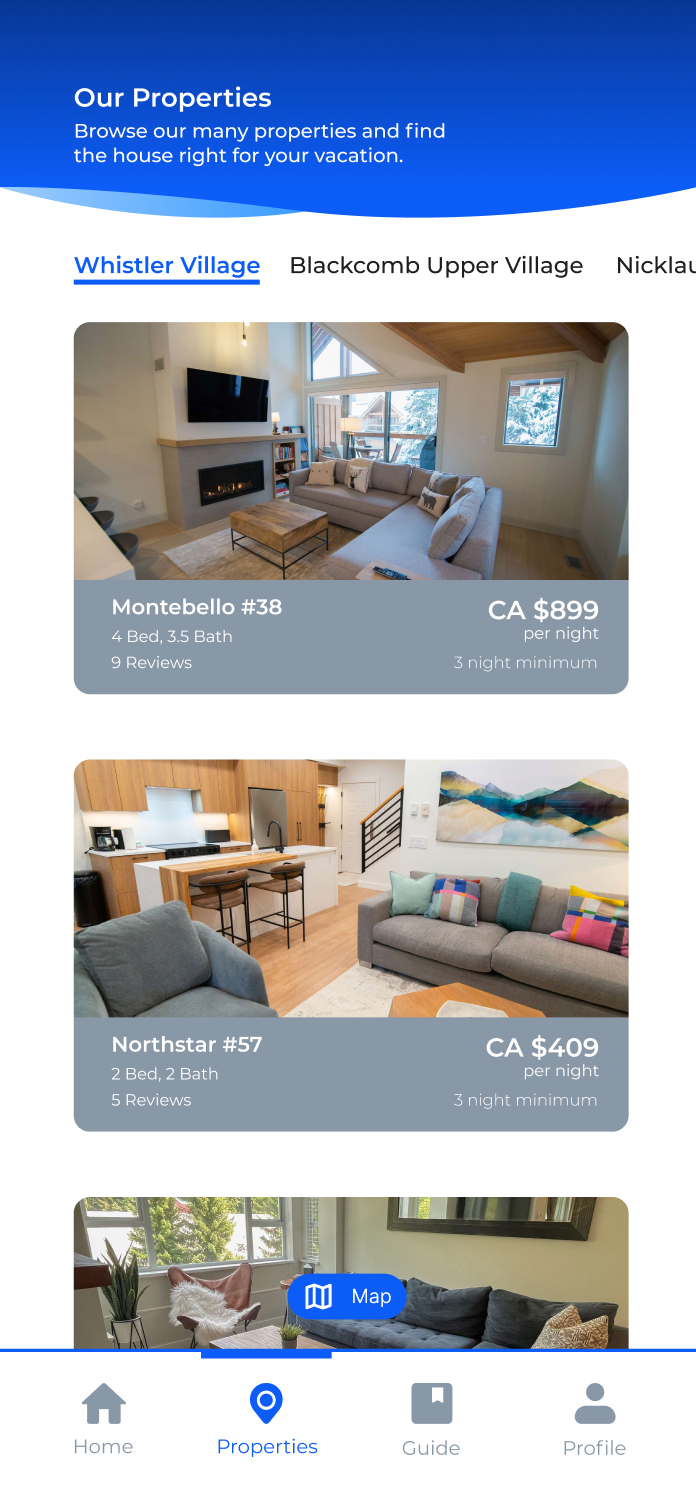
The process wireframes were perhaps the most challenging part of the project as these wireframes were where I experimented with creating the moveable card carousels for the properties and guide screens. Each carousel section was created using an overflow component that hides the property/guide cards that do not appear on the screen, and only show them if the user slides the cards to view more.
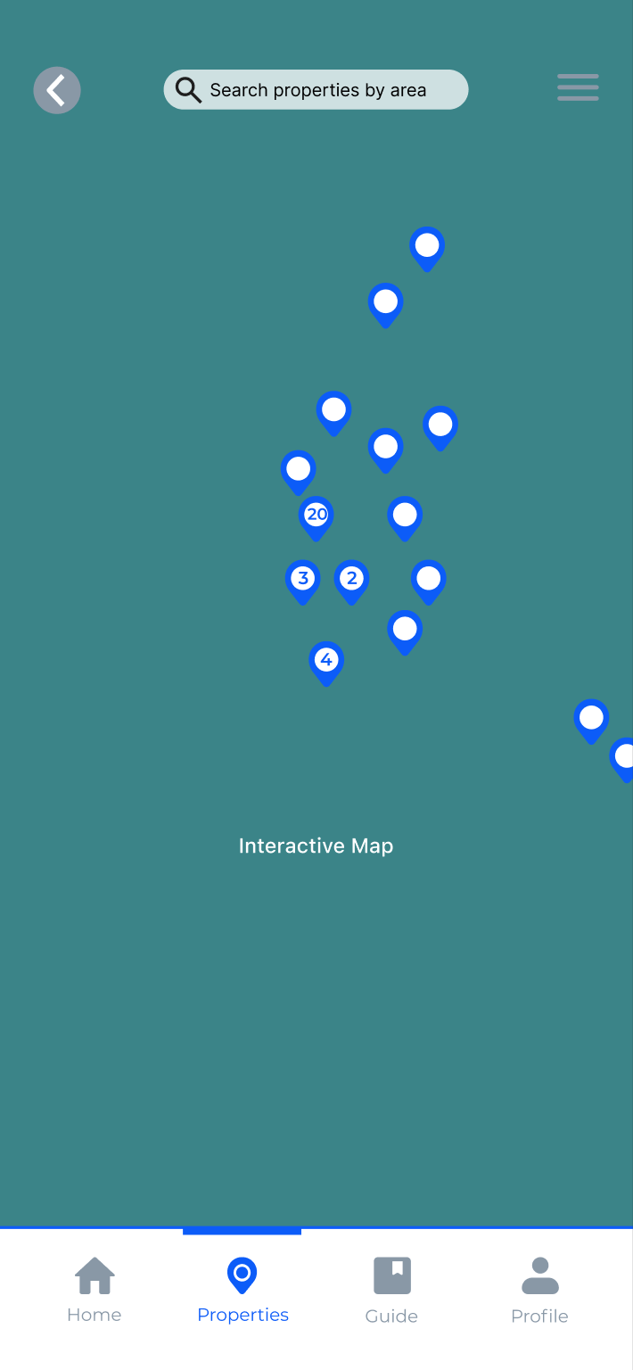
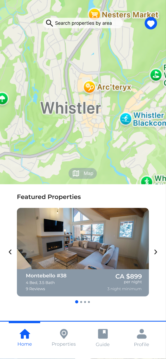
The process wireframes also include an moveable map that displays all of the properties managed by Whistler Superior. Though the majority of all properties on the map, only one is interactive in order to cut back on development time.
The Final Prototype
After building all of the complex components that are vital to the final prototype, I began inputting all of the content into the wireframes. The content is all taken from Whistler Superior Properties website and its partner sites.
To add to the realism of the prototype, I built a series of pop-up screens that appear on the checkout, sign up, and guide screens that add additional information that the user would look for. I also added an Apple Pay to the checkout screen to make the user journey throughout the prototype as realistic as possible.
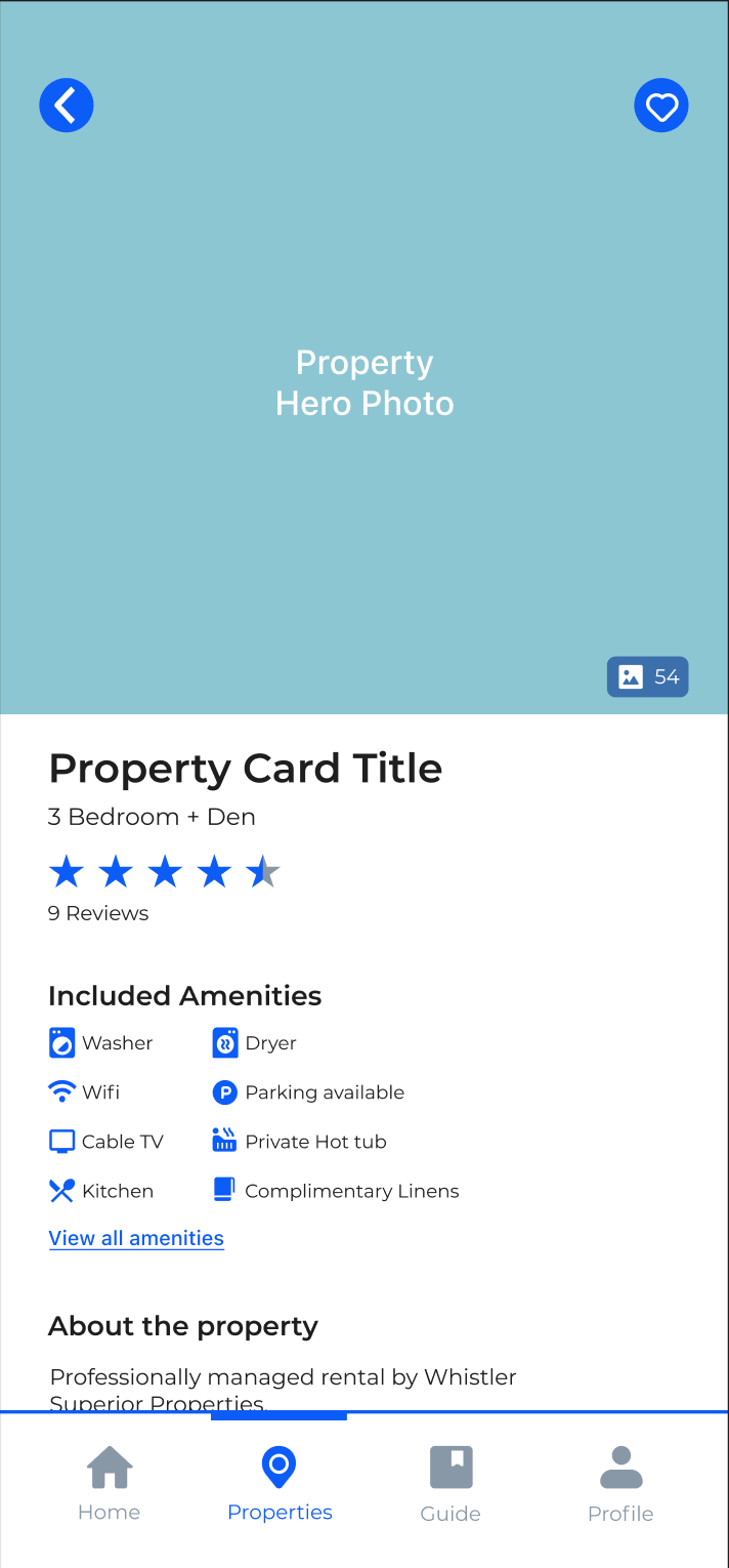
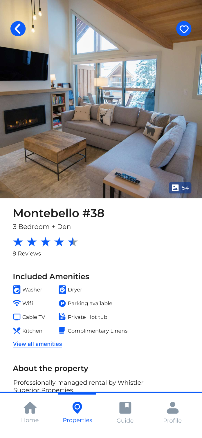
The Property screen features a gallery of images that showcases the property, a list of amenities found on the property, a series of reviews left by previous guests, and a description about the property and nearby attractions.
The Sign Up screen inludes a page that asks the user what activities they intend to partake in while in Whistler, this feature is intended to curate a personalized travel guide featuring activities they want to do, restaurants that other travellers recommend, and popular shopping in and around the Village Stroll.
Similar to the Properties screen, the Guide screen offers the user all of the important information one would require when looking at restaurants such as the restaurant category, contact information, a food gallery, and reviews. Both the Guide and Properties screens have a 'favourite' button which would add the selected restaurants/properties to a favourites screen that the user can return to at a later time.
Interactive Prototype Mockup
Check out the interactive Figma mockup by clicking the button below.